Landscape painting

Back to the angels, color chaos, and more!

Hi y’all,

Welcome back to the blog! A very belated happy new year to you all. It’s been a while since my last post—things got crazy with the holidays, new job/s, and my teaching schedule—but I’m back!

First, I’ve got two happy announcements to share. One is that I made my first sale on Saatchi since I started using it last spring. For those of you who don’t know, Saatchi is the world’s largest online gallery. Here’s the lucky winner:

“Guarded Sunset” - 12’’ x 12’’ - oil on canvas

It found a home with a collector in Boulder, about 30 minutes north of us in Denver. In case you, dear reader, are interested in a piece yourself, feel free to check out my Saatchi page, shoot me an email to inquire about a piece or a commission, or peruse the Shop & Learn tab for more goodies.

The second piece of good news is that I have an interview out with VoyageDenver, a magazine that tells the stories of local creatives and entrepreneurs. We talked craft, how I got into the arts, challenges I’ve faced, plans for the future, and more! You can check out the interview here.

Now for the good (read: nerdy) stuff. Since the weather has gotten cold and snowy, I’ve been back in the home studio. If I can work up the nerve/buy finger warmers, I might do a winter plein air piece or two, buuut for now I’m staying inside.

As a result, I’ve turned my attention back to the Paradise Lost illustration project. In case you don’t remember, I left off with a few studies of Satan from Book I, where he and the other rebellious angels have recently been cast into hell.

I started off with a conte and gouache drawing:

Study of Satan, Paradise Lost, Book I - 16’’ x 12’’ conte and gouache on paper

then did a study on Procreate, where I though through some of the color problems:

Color study of Satan, Paradise Lost, Book I - Procreate

and now, finally, I’ve finished the full oil painting:

Satan Stands to Address His Legions, Paradise Lost, Book I - 30’’ x 24’’ - oil on canvas

One of my main challenges in this painting was staying true to the textual references, which are… tricky. Milton describes hell as being a “dungeon horrible” surrounded by a great, fiery furnace with flames that cast “[n]o light, but rather darkness visible”. Satan also walks on “burning marl” (a kind of stone). So… how does one create flames that cast no light? And how do stones burn without casting light? And how exactly are we supposed to see Satan if there’s no light shining on him?

For those of you who aren’t big painting nerds, rendering an object (i.e., making it look three dimensional) with no light source is… basically impossible. It kind of defies the laws of physics. To get around that, I decided that, given his recent fall (and God’s omniscience in the epic), we could afford a little bit of light from heaven still shining down on him—a way for God to keep an eye on the tricky rebel and for me to solve my physics problem. Thus the light source at the top. This also allowed to me basically ignore whatever light the ‘burning marl’ might’ve cast.

As for the lightless flames, I started off the painting with a relatively dark background, which allowed me to make bits of pure, saturated color pop while keeping their value low (that is, make sure they stayed pretty dark too). I later toned down the background, but I’m pretty happy with the ‘lightless flames’ that poked through in the end. Here’s an early stage of the painting for comparison:

Early stage of the Satan painting

One of my other main challenges was showing Satan’s corruption through the chaos in the warms and cools. As I articulated in an earlier post, I’ve decided to show the level of an angel’s (or demon’s) corruption through the contradictions in their colors. From a distance, the Satan painting may look fairly unified, but when you get closer, you can see the warms and cools knocking against each other:

All this angel painting got me thinking… Milton says angels look this way, but what about the source material—that is, the Bible? Well, that and watching Midnight Mass on Netflix, which I totally recommend.

Turns out, it says some pretty weird stuff. After a little Googling, I found that one of the main sources of Biblical imagery comes from Ezekiel I. Ezekiel sees the heavens open up and has “visions of God”—and, rabbis and theologians have inferred, angels. But they’re not exactly the winged, Cupid-like version we’ve grown so accustomed to.

Instead, some are made of two intersecting wheels, “sparkling like topaz”, and covered in eyes. Yep, you read that right: shiny wheel eyes. That’s what angels look like. According to Maimonides, a prominent Medieval Jewish scholar and philosopher, this was actually the highest rank of angels. Here’s a quick study I worked up for them:

Study for Ezekiel’s vision - pen and ink on paper

And it only gets stranger from there. The other angels — believed to be cherubim — are a hodgepodge of humans and various animals. They have four wings, two of which cover their bodies; the other two face upwards above them. Under these wings, “on all four sides”, they have human hands. Their legs are straight and human, but their feet look “like those of a calf” and gleam “like burnished bronze.”

Perhaps the strangest part of the cherubim are their heads. Heads, plural—four, to be exact. One, facing left, is an ox head. Another, facing right, is a lion head. The other two heads are human and eagle. Ezekiel doesn’t specify where they sit in relation to each other.

This got me thinking, so I started on some studies of the animal heads and working through some of the perspective problems.

Perspective and animal studies for Ezekiel’s vision - pen and ink on paper

As you can see in my notes in the upper left, Ezekiel’s vague description of the eagle and human head create an interesting problem. If they have “four sides,” as Ezekiel mentions when describing the position of their hands and wings, and if we presume that each side gets one head and one head only, then how exactly is Ezekiel able to see all four heads at once? Shouldn’t one be facing away from him?

It’s almost as if Ezekiel is seeing multiple perspectives at once. You know, the core ingredient in Cubism? Maybe Picasso wasn’t such an innovative genius and more of a Biblical scholar. Or maybe there’s a translation issue, or the Bible just isn’t meant to be taken so literally . . .

At any rate, it’s been a fun issue to think through! To do so, I came up with a line drawing/cartoon:

Cherub from Ezekiel’s vision, study - pen and ink on paper

In conclusion, the Bible is the best source of surrealist and modernist imagery. Thank you for coming to my Ted Talk.

Alright, that’s it for this post! Thanks for reading, and keep creating!

Plein airs, watercolors, and more

Hi y’all,

Welcome back to the blog! I’ve got a new plein air piece, updates on collaborations, some watercolors, and a review out.

As I mentioned in my last post, I’ve been trying to get looser and more impressionistic with my landscape paintings. For a brief refresher, here’s the last one I posted:

Guarded Sunset - 12’’ x 12’’ - oil on canvas

I tried to take this a step further in my most recent piece:

Alameda Station - 12’’ x 12’’ - oil on canvas

I definitely had some fun with this one. I liked how the looser brushwork came together, as well as the complexity in the warms and cools, but I think I overcrowded the composition. Live and learn!

In other painting news, I recently started teaching drawing and painting with the Arts and Culture Department at Denver Parks and Rec. As part of my training, I got to shadow the watercolor instructor — a medium I’ve generally avoided. But I got some fun results!

Eye and landscape - 12’’ x 9’’ - watercolor on paper

Hamsa - 12’’ x 9’’ - watercolor on paper

I also got to do a brief oil demo for an open house. I decided to do a little hamsa; definitely had a blast!

Hamsa demo - 12’’ x 12’’ - oil on canvas

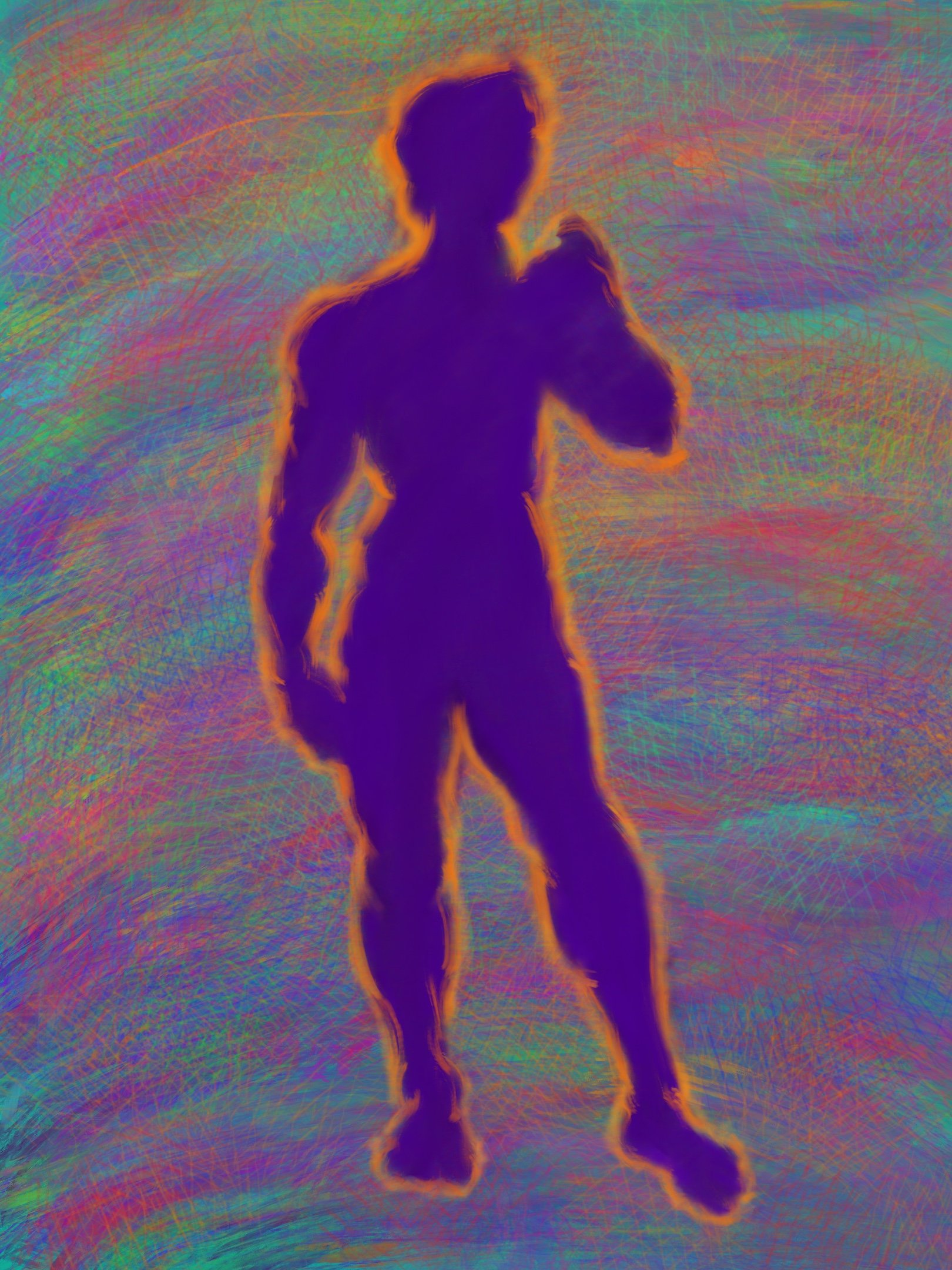
I’m also happy to share that my friend Kevin Shoemaker’s debut album, Sounds for the Young, is out. You can stream it here. As I’m sure many of you know, I made a series of digital drawings for the album release, one for each track. Here they are below:

Capital - Procreate

David - Procreate

Beauty - Procreate

Americana - Procreate

Tutu - Procreate

Honey - Procreate

Prophet - Procreate

Burn - Procreate

Be sure to check out the full album, and stop by Kevin’s website for more!

On the poetry side of things, I’m happy to share a review I wrote for the literary magazine I work for, Consequence, on two excellent poetry collections: Graham Barnhart’s The War Makes Everyone Lonely and Nomi Stone’s Kill Class. You can find the review here.

That’s it for now. Thanks for tuning in, and keep creating!

Hello from Denver! And other updates

Hi y’all,

Welcome back to the blog! I know it’s been quite a long time since my last post… in the neighborhood of three months, I believe. A lot’s happened since then.

As many of you probably know, I relocated to Denver, Colorado. I’ve lived in New York for the last nine years (with a few relatively brief excursions in Oregon, India, Jordan, and Lebanon). It’s been a big change. I’ve been here about a month, and so far I’m really liking it — lots of sun, the food is good, people are genuinely nice and helpful, and, of course, the mountains are only an hour away.

It feels apt that my first painting here and the last painting I finished in New York are both landscapes. Here’s the last one from New York; I’ve posted some of the WIP shots of it on the blog before:

Inwood Hill Park - 12” x 16” - oil on canvas

I painted this at a park in Inwood, the last neighborhood I lived in in the city, just down the road from my apartment. Inwood had long been one of my favorite spots in New York, especially Manhattan, so it feels right to have gotten one last image of it before I left.

It also feels right to start off here in Denver with a painting of the mountains. I grew up in Kansas City and came out to the mountains every chance I got.

Guarded Sunset - 12” x 12” - oil on canvas

This painting (and a number of others) is now available for purchase on Saatchi. And as always, feel free to poke around the “Shop & Learn” section of my website for other goodies or to email me directly at slreichmanart@gmail.com if you’re interested in a piece you see on the website or Instagram (or you’d like to commission a new one).

But back to the fun (nerdy) stuff. I’ve been trying to get a little looser, more impressionistic with my landscapes. I’ve always naturally favored a rougher, more painterly approach, but I’ve often felt myself conflicted between the desire to render more tightly, adhering more to “reality” (whatever that means) and the desire to let the brushstrokes do more of the work.

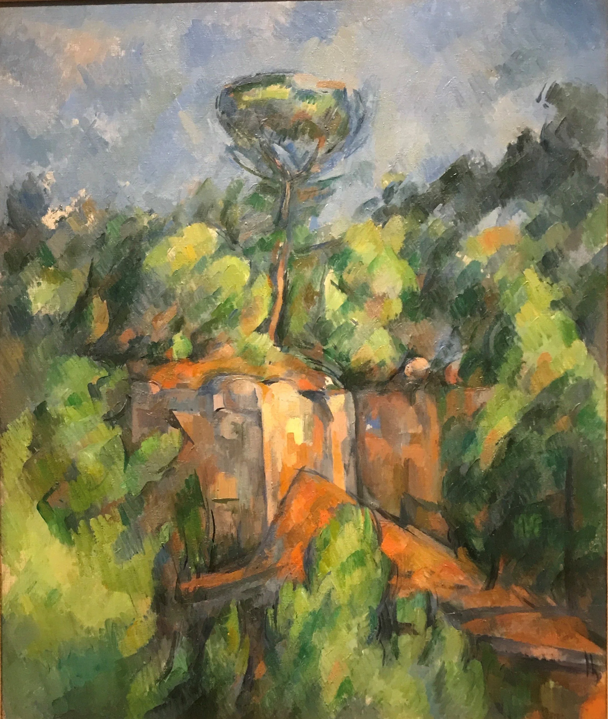
Between New York and Denver, I spent a couple of weeks back in my hometown (more on that later). While I was there, I went to the Nelson, the biggest museum in Kansas City. As I wandered around the French painting section, I found myself more and more drawn to the impressionists and post-impressionists:

A post-impresionist whose name I failed to take down… woops

Paul Cezanne

Claude Monet

Their free brush strokes and their impressive power to suggest form, light, even people and gesture with so little — that’s something I aspire to. I’m a long way away, but, fortunately for me, I’ve got some great landscapes to practice on here in Colorado.

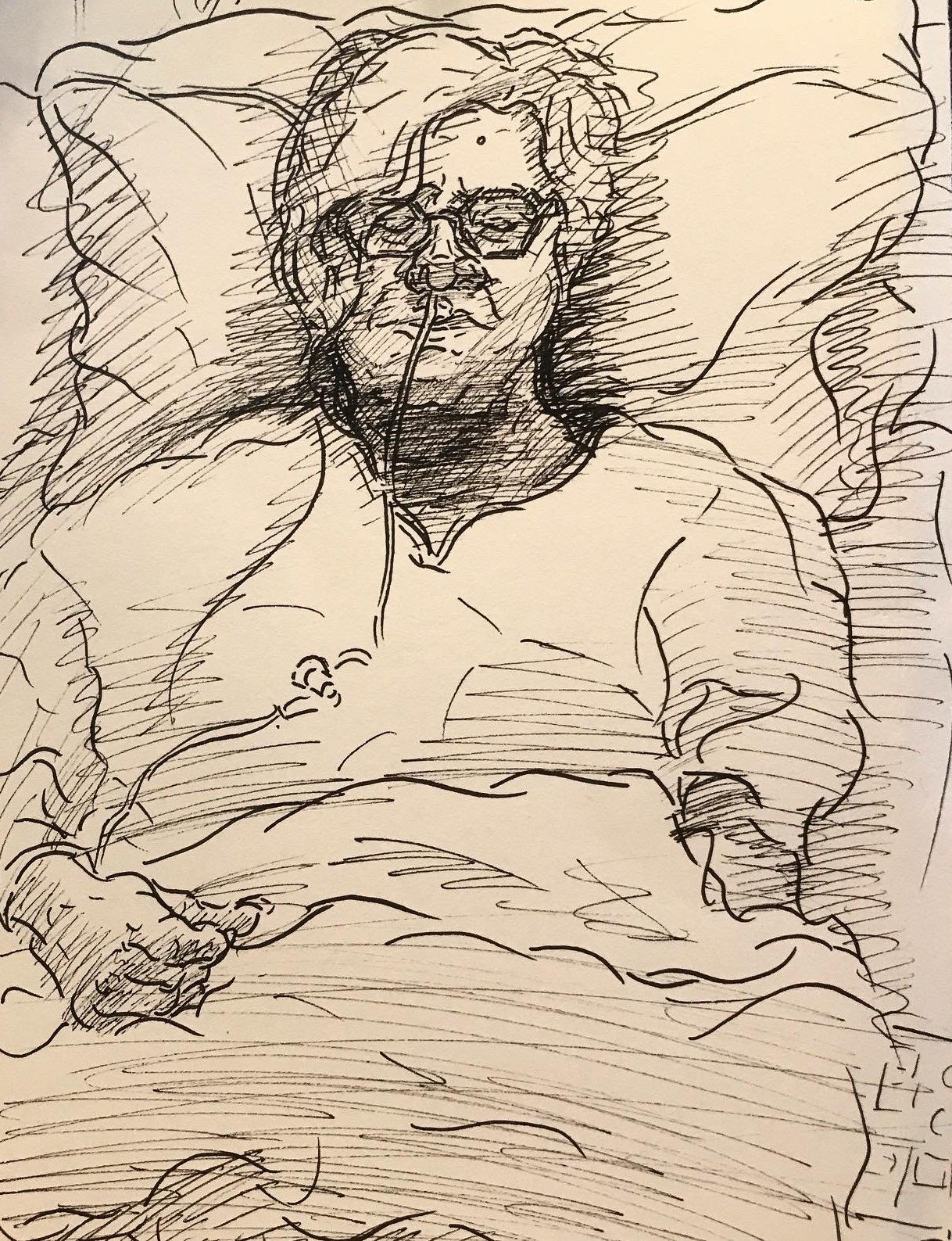
I was back in Kansas City for a couple of weeks. My mom, as I suspect some readers here might know, was having surgery to remove a benign tumor on her brain stem, and I was in town to spend time with her before and after the surgery. This was her third round having the tumor removed since 1999, and it was definitely trying for her and the rest of the family, especially with the pandemic still strong in the Midwest. That’s made me all the more grateful to have such strong, supportive loved ones. The surgery was a success, and my mom, trooper that she is, is doing much better.

During my time in KC, I got a few sketches in of my mom’s recovery. I drew this a few days post-op:

Mom, post-op; pen and ink on paper

And this I drew after she was released from the hospital and was recovering at home:

Mom, recovery; pen and ink on paper

In a strangely well-timed development, I also got my contributor copies of the two poems I had accepted for publication way back in April right as my mom was getting through the worst of the recovery. They’re both about family, and one (I’ll let you guess which) I actually originally wrote for my mom’s birthday. It’s been through a good amount of revision since then (they both have), so it’s great to see them out in the world.

Mother Memories, published by Sand Hills Literary Magazine

Heaven Cannot Hold Her, published by Sand Hills Literary Magazine

There’s a lot of gorgeous work in this issue of Sand Hills Literary Magazine, the journal that took them, so please consider supporting their amazing work by purchasing a copy of the print issue!

I’m also happy to share that my drawing of my partner’s cat, Cashmere, was invited to an online exhibit organized by Exhibizone and distributed by Biafarin. You can check out my page on the online exhibit here. And here’s the drawing:

Cashmere - mixed media on paper - 16” x 12”

The exhibit is open til the end of the month, so be sure to stop by and check it out soon! And in case you’re wondering, yes, Cashmere knows how cute she is.

Finally, I’m happy to share that my collaboration with musician, producer, and 10/10 good friend Kevin Shoemaker, a.ka. Dandelot, went great! I made eight digital drawings for Kevin’s debut album (one for each track), and we released one a day, along with behind the scenes info on the making of each track, in an exclusive online exhibit — Chanukah came early this year.

We’ll be selling posters with all eight drawings soon. In the meantime, check out our discussion on the collaboration below, and be sure to get signed up for updates on the album release, album swag, and more here!

That’s it for now! I should be posting here more regularly now that I’m relatively settled. In the meantime, thanks so much for reading, and keep creating!