Hi y’all,
Welcome back to the blog! I know it’s been quite a long time since my last post… in the neighborhood of three months, I believe. A lot’s happened since then.
As many of you probably know, I relocated to Denver, Colorado. I’ve lived in New York for the last nine years (with a few relatively brief excursions in Oregon, India, Jordan, and Lebanon). It’s been a big change. I’ve been here about a month, and so far I’m really liking it — lots of sun, the food is good, people are genuinely nice and helpful, and, of course, the mountains are only an hour away.
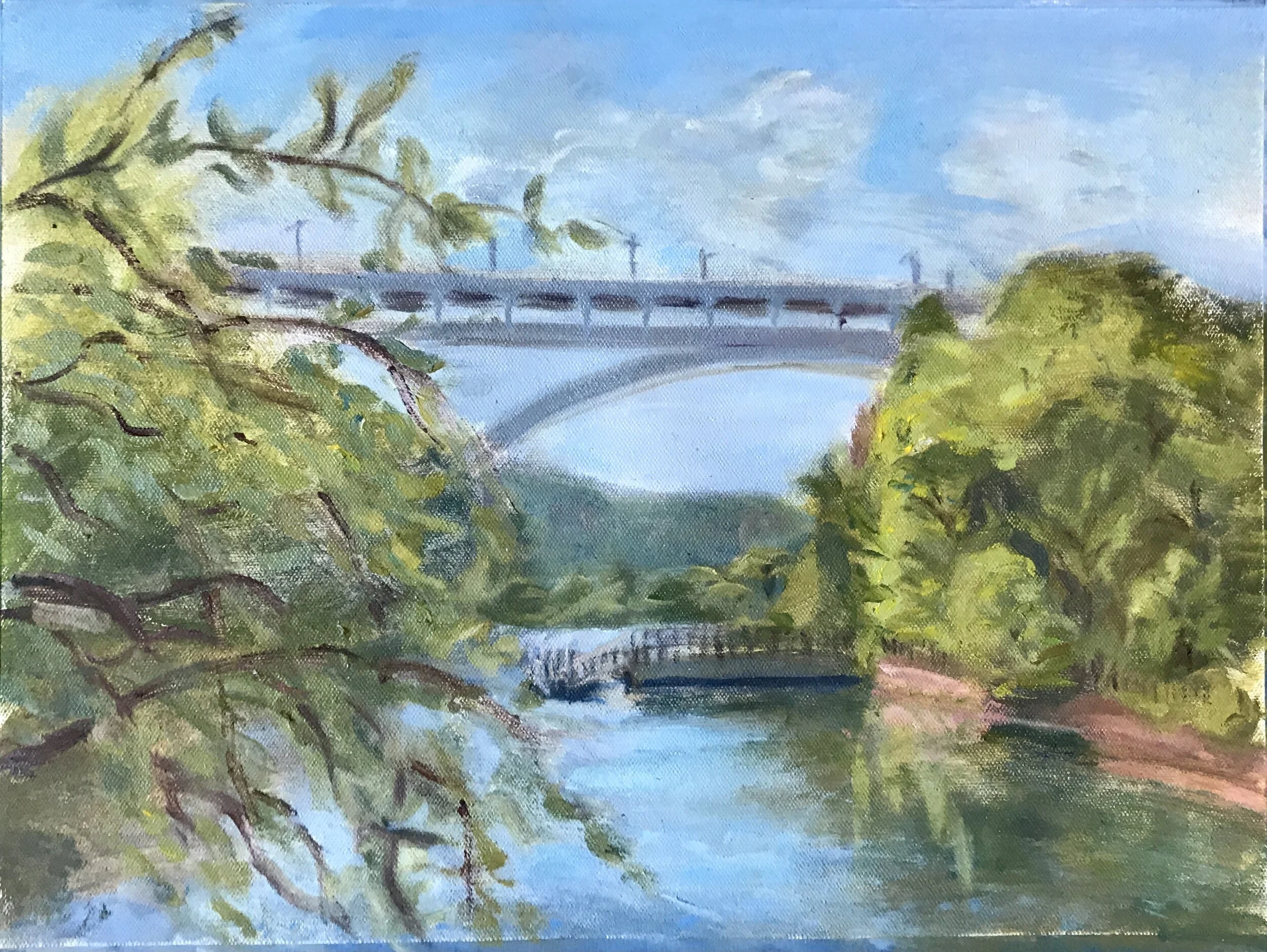
It feels apt that my first painting here and the last painting I finished in New York are both landscapes. Here’s the last one from New York; I’ve posted some of the WIP shots of it on the blog before:

Inwood Hill Park - 12” x 16” - oil on canvas
I painted this at a park in Inwood, the last neighborhood I lived in in the city, just down the road from my apartment. Inwood had long been one of my favorite spots in New York, especially Manhattan, so it feels right to have gotten one last image of it before I left.
It also feels right to start off here in Denver with a painting of the mountains. I grew up in Kansas City and came out to the mountains every chance I got.

Guarded Sunset - 12” x 12” - oil on canvas
This painting (and a number of others) is now available for purchase on Saatchi. And as always, feel free to poke around the “Shop & Learn” section of my website for other goodies or to email me directly at slreichmanart@gmail.com if you’re interested in a piece you see on the website or Instagram (or you’d like to commission a new one).
But back to the fun (nerdy) stuff. I’ve been trying to get a little looser, more impressionistic with my landscapes. I’ve always naturally favored a rougher, more painterly approach, but I’ve often felt myself conflicted between the desire to render more tightly, adhering more to “reality” (whatever that means) and the desire to let the brushstrokes do more of the work.
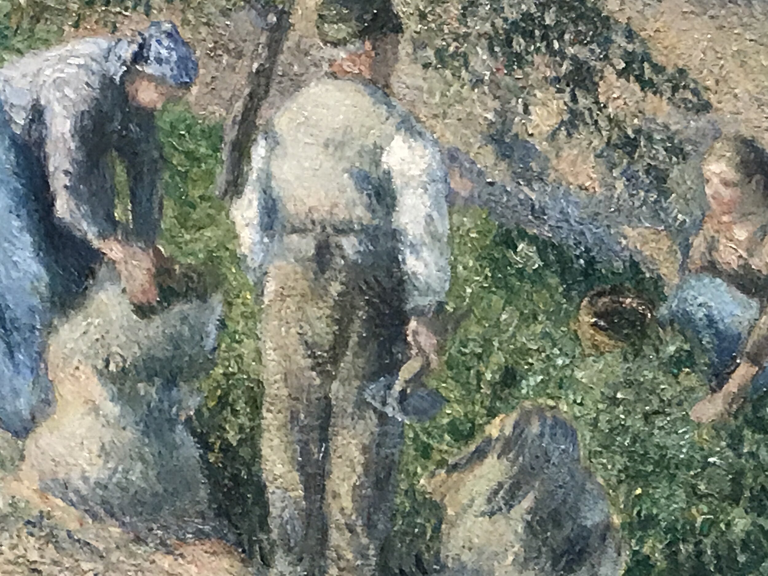
Between New York and Denver, I spent a couple of weeks back in my hometown (more on that later). While I was there, I went to the Nelson, the biggest museum in Kansas City. As I wandered around the French painting section, I found myself more and more drawn to the impressionists and post-impressionists:

A post-impresionist whose name I failed to take down… woops
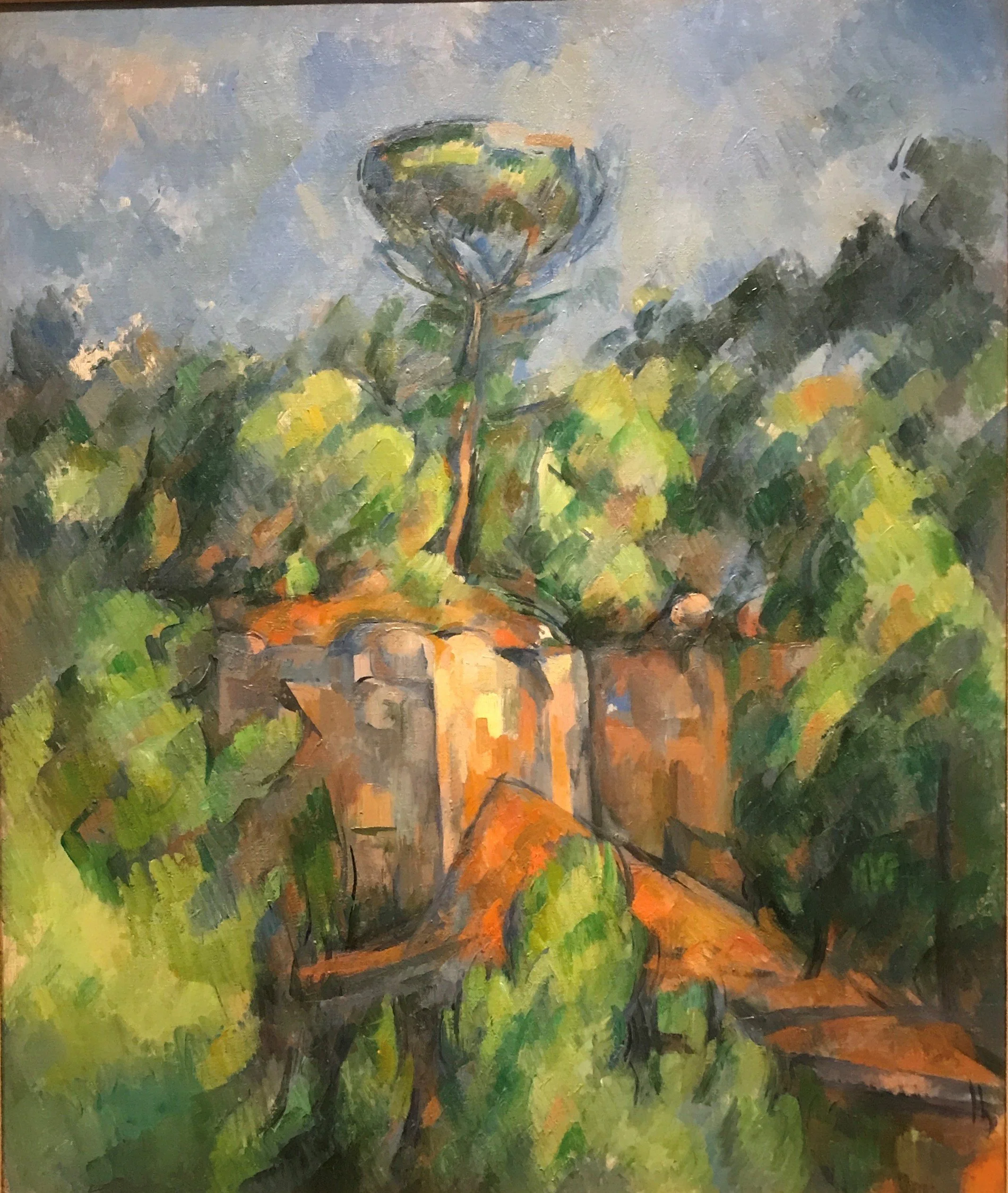
Paul Cezanne

Claude Monet
Their free brush strokes and their impressive power to suggest form, light, even people and gesture with so little — that’s something I aspire to. I’m a long way away, but, fortunately for me, I’ve got some great landscapes to practice on here in Colorado.
I was back in Kansas City for a couple of weeks. My mom, as I suspect some readers here might know, was having surgery to remove a benign tumor on her brain stem, and I was in town to spend time with her before and after the surgery. This was her third round having the tumor removed since 1999, and it was definitely trying for her and the rest of the family, especially with the pandemic still strong in the Midwest. That’s made me all the more grateful to have such strong, supportive loved ones. The surgery was a success, and my mom, trooper that she is, is doing much better.
During my time in KC, I got a few sketches in of my mom’s recovery. I drew this a few days post-op:
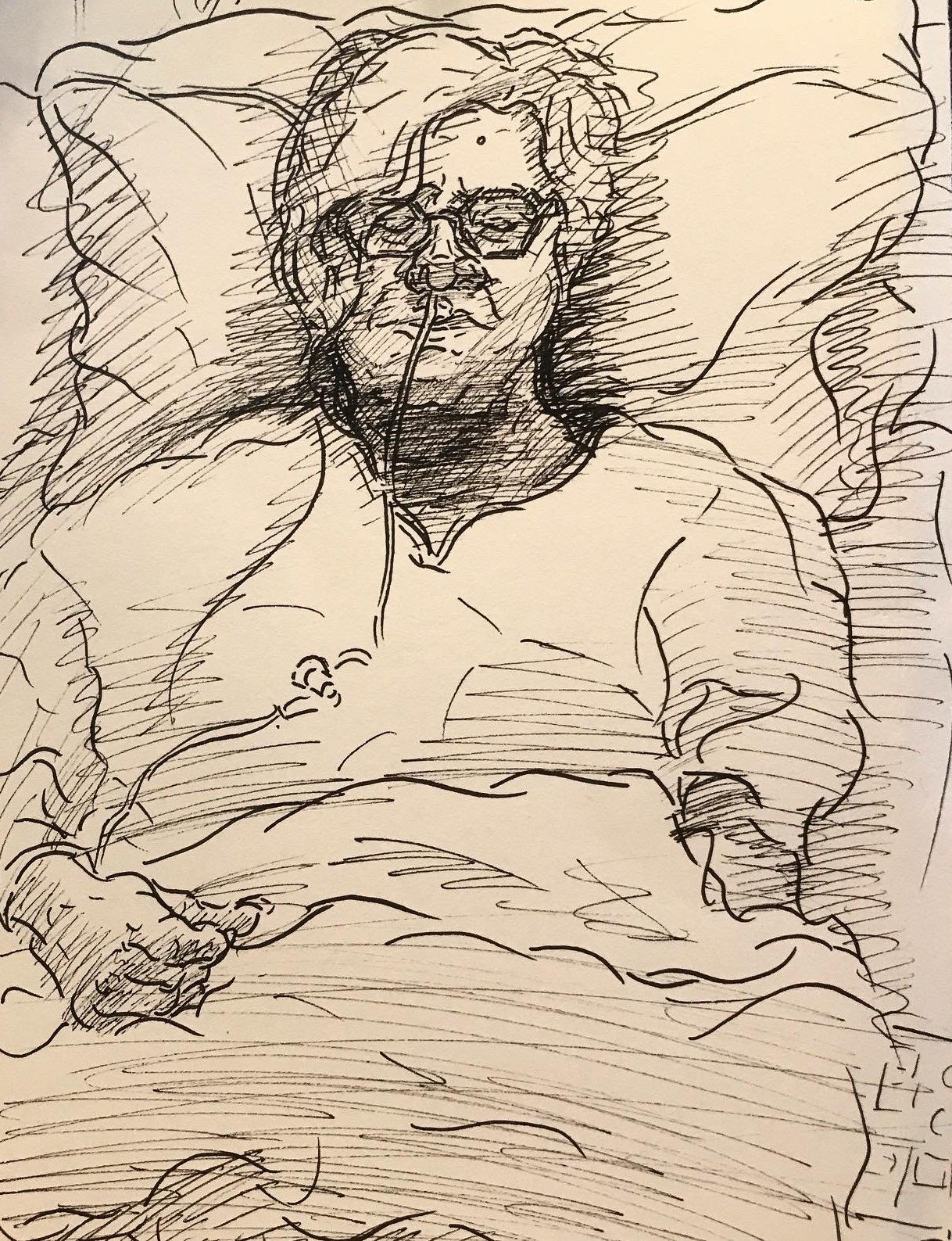
Mom, post-op; pen and ink on paper
And this I drew after she was released from the hospital and was recovering at home:

Mom, recovery; pen and ink on paper
In a strangely well-timed development, I also got my contributor copies of the two poems I had accepted for publication way back in April right as my mom was getting through the worst of the recovery. They’re both about family, and one (I’ll let you guess which) I actually originally wrote for my mom’s birthday. It’s been through a good amount of revision since then (they both have), so it’s great to see them out in the world.

Mother Memories, published by Sand Hills Literary Magazine

Heaven Cannot Hold Her, published by Sand Hills Literary Magazine
There’s a lot of gorgeous work in this issue of Sand Hills Literary Magazine, the journal that took them, so please consider supporting their amazing work by purchasing a copy of the print issue!
I’m also happy to share that my drawing of my partner’s cat, Cashmere, was invited to an online exhibit organized by Exhibizone and distributed by Biafarin. You can check out my page on the online exhibit here. And here’s the drawing:

Cashmere - mixed media on paper - 16” x 12”
The exhibit is open til the end of the month, so be sure to stop by and check it out soon! And in case you’re wondering, yes, Cashmere knows how cute she is.
Finally, I’m happy to share that my collaboration with musician, producer, and 10/10 good friend Kevin Shoemaker, a.ka. Dandelot, went great! I made eight digital drawings for Kevin’s debut album (one for each track), and we released one a day, along with behind the scenes info on the making of each track, in an exclusive online exhibit — Chanukah came early this year.
We’ll be selling posters with all eight drawings soon. In the meantime, check out our discussion on the collaboration below, and be sure to get signed up for updates on the album release, album swag, and more here!
That’s it for now! I should be posting here more regularly now that I’m relatively settled. In the meantime, thanks so much for reading, and keep creating!