poetry

Hello again - updates, angels, animals

Hi y’all,

Welcome back to the blog! After a long . . . long hiatus. Things got a little crazy with a fuller teaching schedule, but I finally have some time to share a bit about the past months with you. Going forward, I’ll try to update the blog closer to once a month.

Most recently, I took part in the Pancakes and Booze show in Denver. I showed several pieces from my hamsa series, as well as one of my skull paintings and “The Dionysian.” Here’s them all together for the show:

From left to right, top to bottom: “Hamsa (Space),” “Hamsa (Blessing),” “The Dionysian,” “Skull #3”

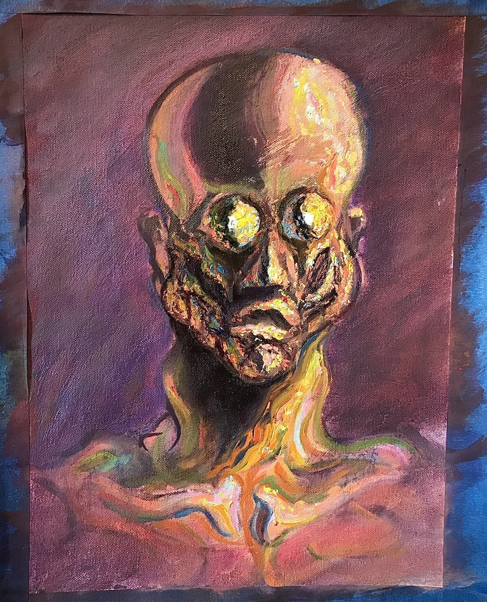
As you might’ve guessed from the title (“Skull #3”), the skull painting is one of several. Here are the others for the curious:

“Skull #2” - 10’’ x 8’’ - oil and acrylic on canvas

“Skull #1” - 11’’ x 8’’ - oil on canvas

As you can see, I started with a lot more color, but to get the effect I was shooting for, I found it actually worked better to use a more limited palette. I’ve had this idea of trying to use color to do what William Blake did with line for some time now. In his drawings and prints, Blake overemphasized contour, making it hard to tell if lines were moving toward or away from you and if they were in the foreground or background, which in turn created some fascinating optical allusions. If you’d like to see some examples (and read more about how this worked), check out Stephen Leo Carr’s “Visionary Syntax: Nontyrannical Coherence in Blake’s Visual Art.”

I had experimented with this idea in abstract paintings before starting the skull series:

“Coherence” - 5’x3’ - mixed media on raw canvas

“Line, Color, Value” - 5’ x 3’ - Mixed media on canvas

but I hadn’t tried it with something representational. Once I did, I found that having a lot of saturated color made the whole thing feel a little like foreground, which was interesting, but not what I was shooting for. What I wanted was a foreground and a background that were constantly shifting, depending on what you look at and how long you look at it for.

What worked much better was to start with a very limited palette — the Zorn palette to be exact — using oil paints, then add a bit of acrylic magenta on top of the oils once they dried:

“Skull #3” - 12’’ x 9’’ - oil and acrylic on canvas

Because the limited palette created a clear background and foreground first, the saturated acrylic was able to move fluidly between them. The shift in texture from the smoother, earthier oils to the more irregular, plasticky acrylic also created a contrast I hadn’t expected. Happy accidents, right?

“Skull #3” has sold, but if you’re interested in the other two, they’re still available — feel free to shoot me a quick email to inquire about them.

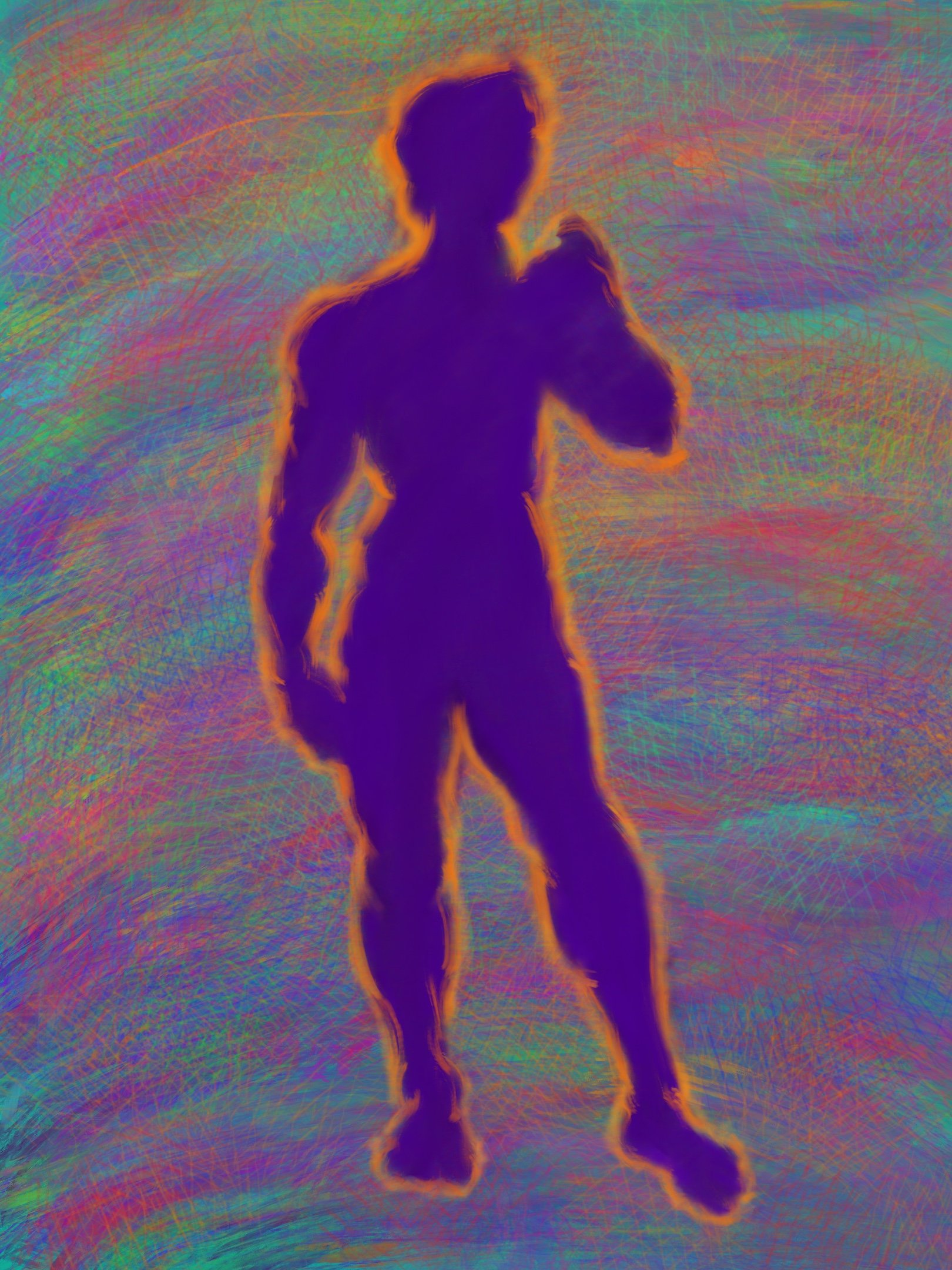
The remaining painting, “The Dionysian,” has equally nerdy origins. I began reading Nietzsche’s The Birth of Tragedy the first summer of the pandemic. Apparently, it was really important to Rothko, plus the title seemed apt for the time . . .

“The Dionysian” - 18’’ x 13’’ - oil and acrylic on canvas

In The Birth of Tragedy, Nietzsche argues that there’s an underlying tension in ancient Greek art between what he calls the Dionysian and the Apollonian. The Dionysian, connected to the cult of, you guessed it, Dionysus, embraces the primordial chaos of the universe. Nietzsche identifies more fluid art forms with this impulse — music, lyric poetry, non-representational art. The Apollonian was named for, right again, the cult of Apollo. It tried to redeem the pain of primordial chaos by creating order and beauty — narrative writing and representational art are its chief . . . representatives. In this piece, I wanted the viewer to get mostly swept away into Dionysian chaos but to also have a little bit of Apollonian representation to hold onto.

In other news, I have a poem out in issue no. 6 of Pinky Thinker Press. The poem, “Court Poet for a Night,” came out of a year or so of experiments in which I was looking for ways to unite how I might perform a poem in a spoken word and/or musical context and the way the poem appears on the page. Well, that and being very broke during art school and finding some very strange ways to make money.

I also recently did an interview with Shoutout Colorado. We talked about my transition from casework to the arts, influences, favorite spots in Denver, and more!

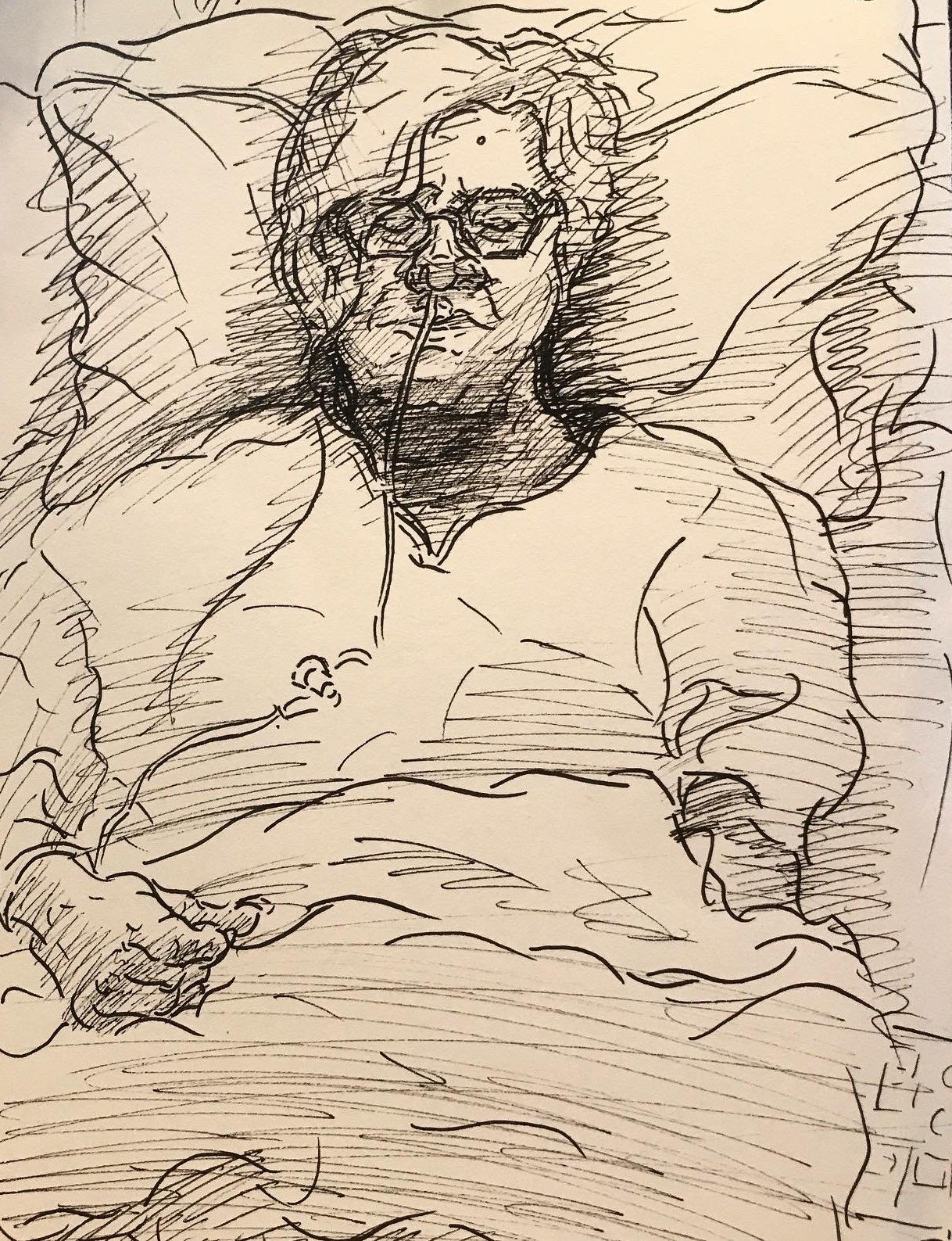
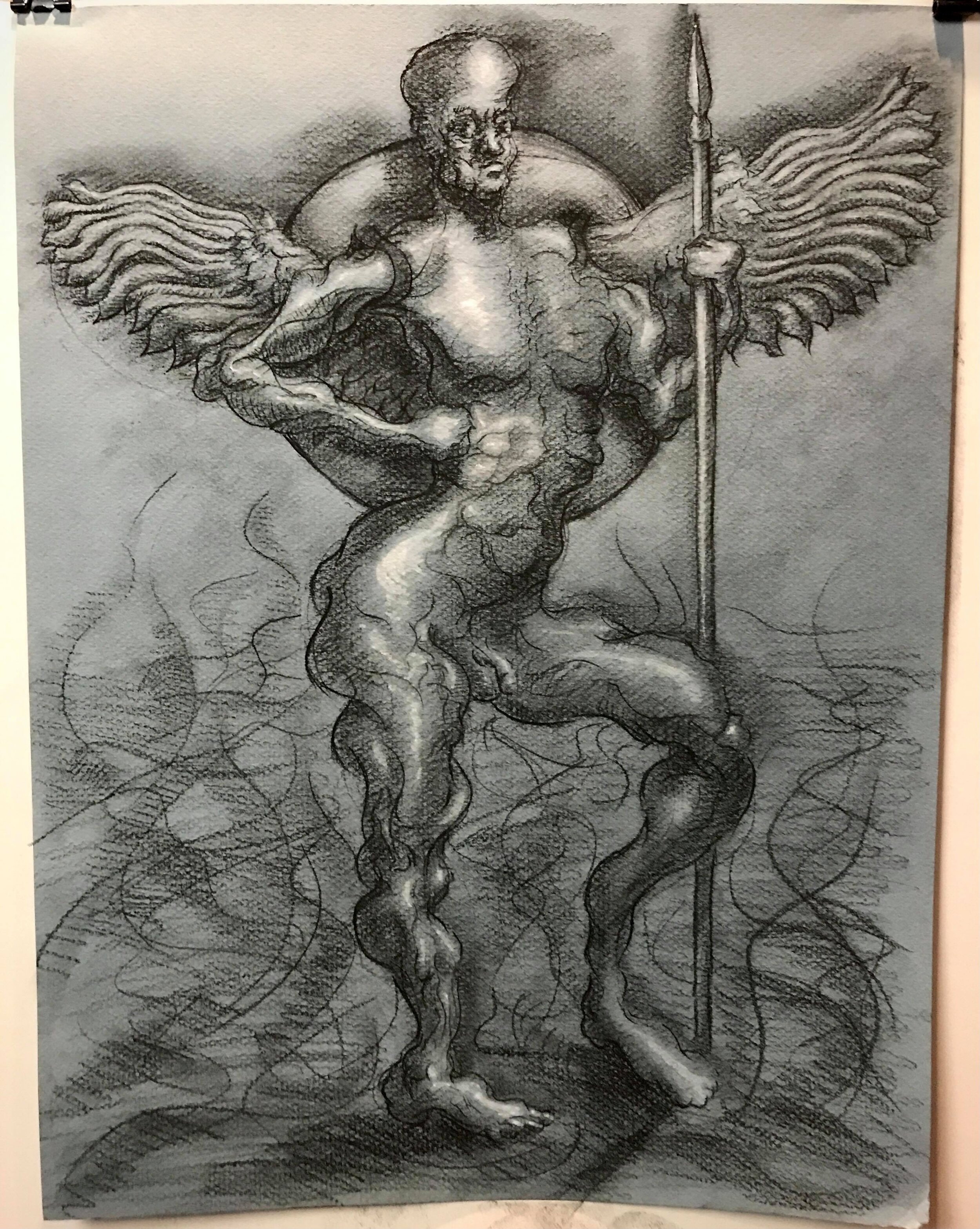
I’ve also been continuing to hack away at the (new) angel project. I’ve taken a detour from the Paradise Lost project for a while, focusing instead on the angels as described in Ezekiel I. When I last updated the blog, I had just completed my cartoon of one of the cherubim from Ezekiel’s vision:

12’’ x 9’’ - pen and ink on paper

Since then, I’ve created a fully rendered version:

12.5’’ x 12’’ - charcoal on paper

As you can see, Ezekiel’s cherubim have several heads, only one of which is human. Since I’m not super familiar with lions, eagles, or oxen, I’ve decided to do several oil paint studies before moving onto a full cherub. So far, I’ve completed the lion head:

Oil on canvas - 14’’ x 10’’

and the eagle is under (somewhat painstaking) progress:

14’’ x 10’’ - oil on canvas

Welp, that’s all for now, folks. Thanks for tuning in, and, as always, keep creating!

Back to the angels, color chaos, and more!

Hi y’all,

Welcome back to the blog! A very belated happy new year to you all. It’s been a while since my last post—things got crazy with the holidays, new job/s, and my teaching schedule—but I’m back!

First, I’ve got two happy announcements to share. One is that I made my first sale on Saatchi since I started using it last spring. For those of you who don’t know, Saatchi is the world’s largest online gallery. Here’s the lucky winner:

“Guarded Sunset” - 12’’ x 12’’ - oil on canvas

It found a home with a collector in Boulder, about 30 minutes north of us in Denver. In case you, dear reader, are interested in a piece yourself, feel free to check out my Saatchi page, shoot me an email to inquire about a piece or a commission, or peruse the Shop & Learn tab for more goodies.

The second piece of good news is that I have an interview out with VoyageDenver, a magazine that tells the stories of local creatives and entrepreneurs. We talked craft, how I got into the arts, challenges I’ve faced, plans for the future, and more! You can check out the interview here.

Now for the good (read: nerdy) stuff. Since the weather has gotten cold and snowy, I’ve been back in the home studio. If I can work up the nerve/buy finger warmers, I might do a winter plein air piece or two, buuut for now I’m staying inside.

As a result, I’ve turned my attention back to the Paradise Lost illustration project. In case you don’t remember, I left off with a few studies of Satan from Book I, where he and the other rebellious angels have recently been cast into hell.

I started off with a conte and gouache drawing:

Study of Satan, Paradise Lost, Book I - 16’’ x 12’’ conte and gouache on paper

then did a study on Procreate, where I though through some of the color problems:

Color study of Satan, Paradise Lost, Book I - Procreate

and now, finally, I’ve finished the full oil painting:

Satan Stands to Address His Legions, Paradise Lost, Book I - 30’’ x 24’’ - oil on canvas

One of my main challenges in this painting was staying true to the textual references, which are… tricky. Milton describes hell as being a “dungeon horrible” surrounded by a great, fiery furnace with flames that cast “[n]o light, but rather darkness visible”. Satan also walks on “burning marl” (a kind of stone). So… how does one create flames that cast no light? And how do stones burn without casting light? And how exactly are we supposed to see Satan if there’s no light shining on him?

For those of you who aren’t big painting nerds, rendering an object (i.e., making it look three dimensional) with no light source is… basically impossible. It kind of defies the laws of physics. To get around that, I decided that, given his recent fall (and God’s omniscience in the epic), we could afford a little bit of light from heaven still shining down on him—a way for God to keep an eye on the tricky rebel and for me to solve my physics problem. Thus the light source at the top. This also allowed to me basically ignore whatever light the ‘burning marl’ might’ve cast.

As for the lightless flames, I started off the painting with a relatively dark background, which allowed me to make bits of pure, saturated color pop while keeping their value low (that is, make sure they stayed pretty dark too). I later toned down the background, but I’m pretty happy with the ‘lightless flames’ that poked through in the end. Here’s an early stage of the painting for comparison:

Early stage of the Satan painting

One of my other main challenges was showing Satan’s corruption through the chaos in the warms and cools. As I articulated in an earlier post, I’ve decided to show the level of an angel’s (or demon’s) corruption through the contradictions in their colors. From a distance, the Satan painting may look fairly unified, but when you get closer, you can see the warms and cools knocking against each other:

All this angel painting got me thinking… Milton says angels look this way, but what about the source material—that is, the Bible? Well, that and watching Midnight Mass on Netflix, which I totally recommend.

Turns out, it says some pretty weird stuff. After a little Googling, I found that one of the main sources of Biblical imagery comes from Ezekiel I. Ezekiel sees the heavens open up and has “visions of God”—and, rabbis and theologians have inferred, angels. But they’re not exactly the winged, Cupid-like version we’ve grown so accustomed to.

Instead, some are made of two intersecting wheels, “sparkling like topaz”, and covered in eyes. Yep, you read that right: shiny wheel eyes. That’s what angels look like. According to Maimonides, a prominent Medieval Jewish scholar and philosopher, this was actually the highest rank of angels. Here’s a quick study I worked up for them:

Study for Ezekiel’s vision - pen and ink on paper

And it only gets stranger from there. The other angels — believed to be cherubim — are a hodgepodge of humans and various animals. They have four wings, two of which cover their bodies; the other two face upwards above them. Under these wings, “on all four sides”, they have human hands. Their legs are straight and human, but their feet look “like those of a calf” and gleam “like burnished bronze.”

Perhaps the strangest part of the cherubim are their heads. Heads, plural—four, to be exact. One, facing left, is an ox head. Another, facing right, is a lion head. The other two heads are human and eagle. Ezekiel doesn’t specify where they sit in relation to each other.

This got me thinking, so I started on some studies of the animal heads and working through some of the perspective problems.

Perspective and animal studies for Ezekiel’s vision - pen and ink on paper

As you can see in my notes in the upper left, Ezekiel’s vague description of the eagle and human head create an interesting problem. If they have “four sides,” as Ezekiel mentions when describing the position of their hands and wings, and if we presume that each side gets one head and one head only, then how exactly is Ezekiel able to see all four heads at once? Shouldn’t one be facing away from him?

It’s almost as if Ezekiel is seeing multiple perspectives at once. You know, the core ingredient in Cubism? Maybe Picasso wasn’t such an innovative genius and more of a Biblical scholar. Or maybe there’s a translation issue, or the Bible just isn’t meant to be taken so literally . . .

At any rate, it’s been a fun issue to think through! To do so, I came up with a line drawing/cartoon:

Cherub from Ezekiel’s vision, study - pen and ink on paper

In conclusion, the Bible is the best source of surrealist and modernist imagery. Thank you for coming to my Ted Talk.

Alright, that’s it for this post! Thanks for reading, and keep creating!

Plein airs, watercolors, and more

Hi y’all,

Welcome back to the blog! I’ve got a new plein air piece, updates on collaborations, some watercolors, and a review out.

As I mentioned in my last post, I’ve been trying to get looser and more impressionistic with my landscape paintings. For a brief refresher, here’s the last one I posted:

Guarded Sunset - 12’’ x 12’’ - oil on canvas

I tried to take this a step further in my most recent piece:

Alameda Station - 12’’ x 12’’ - oil on canvas

I definitely had some fun with this one. I liked how the looser brushwork came together, as well as the complexity in the warms and cools, but I think I overcrowded the composition. Live and learn!

In other painting news, I recently started teaching drawing and painting with the Arts and Culture Department at Denver Parks and Rec. As part of my training, I got to shadow the watercolor instructor — a medium I’ve generally avoided. But I got some fun results!

Eye and landscape - 12’’ x 9’’ - watercolor on paper

Hamsa - 12’’ x 9’’ - watercolor on paper

I also got to do a brief oil demo for an open house. I decided to do a little hamsa; definitely had a blast!

Hamsa demo - 12’’ x 12’’ - oil on canvas

I’m also happy to share that my friend Kevin Shoemaker’s debut album, Sounds for the Young, is out. You can stream it here. As I’m sure many of you know, I made a series of digital drawings for the album release, one for each track. Here they are below:

Capital - Procreate

David - Procreate

Beauty - Procreate

Americana - Procreate

Tutu - Procreate

Honey - Procreate

Prophet - Procreate

Burn - Procreate

Be sure to check out the full album, and stop by Kevin’s website for more!

On the poetry side of things, I’m happy to share a review I wrote for the literary magazine I work for, Consequence, on two excellent poetry collections: Graham Barnhart’s The War Makes Everyone Lonely and Nomi Stone’s Kill Class. You can find the review here.

That’s it for now. Thanks for tuning in, and keep creating!

Hello from Denver! And other updates

Hi y’all,

Welcome back to the blog! I know it’s been quite a long time since my last post… in the neighborhood of three months, I believe. A lot’s happened since then.

As many of you probably know, I relocated to Denver, Colorado. I’ve lived in New York for the last nine years (with a few relatively brief excursions in Oregon, India, Jordan, and Lebanon). It’s been a big change. I’ve been here about a month, and so far I’m really liking it — lots of sun, the food is good, people are genuinely nice and helpful, and, of course, the mountains are only an hour away.

It feels apt that my first painting here and the last painting I finished in New York are both landscapes. Here’s the last one from New York; I’ve posted some of the WIP shots of it on the blog before:

Inwood Hill Park - 12” x 16” - oil on canvas

I painted this at a park in Inwood, the last neighborhood I lived in in the city, just down the road from my apartment. Inwood had long been one of my favorite spots in New York, especially Manhattan, so it feels right to have gotten one last image of it before I left.

It also feels right to start off here in Denver with a painting of the mountains. I grew up in Kansas City and came out to the mountains every chance I got.

Guarded Sunset - 12” x 12” - oil on canvas

This painting (and a number of others) is now available for purchase on Saatchi. And as always, feel free to poke around the “Shop & Learn” section of my website for other goodies or to email me directly at slreichmanart@gmail.com if you’re interested in a piece you see on the website or Instagram (or you’d like to commission a new one).

But back to the fun (nerdy) stuff. I’ve been trying to get a little looser, more impressionistic with my landscapes. I’ve always naturally favored a rougher, more painterly approach, but I’ve often felt myself conflicted between the desire to render more tightly, adhering more to “reality” (whatever that means) and the desire to let the brushstrokes do more of the work.

Between New York and Denver, I spent a couple of weeks back in my hometown (more on that later). While I was there, I went to the Nelson, the biggest museum in Kansas City. As I wandered around the French painting section, I found myself more and more drawn to the impressionists and post-impressionists:

A post-impresionist whose name I failed to take down… woops

Paul Cezanne

Claude Monet

Their free brush strokes and their impressive power to suggest form, light, even people and gesture with so little — that’s something I aspire to. I’m a long way away, but, fortunately for me, I’ve got some great landscapes to practice on here in Colorado.

I was back in Kansas City for a couple of weeks. My mom, as I suspect some readers here might know, was having surgery to remove a benign tumor on her brain stem, and I was in town to spend time with her before and after the surgery. This was her third round having the tumor removed since 1999, and it was definitely trying for her and the rest of the family, especially with the pandemic still strong in the Midwest. That’s made me all the more grateful to have such strong, supportive loved ones. The surgery was a success, and my mom, trooper that she is, is doing much better.

During my time in KC, I got a few sketches in of my mom’s recovery. I drew this a few days post-op:

Mom, post-op; pen and ink on paper

And this I drew after she was released from the hospital and was recovering at home:

Mom, recovery; pen and ink on paper

In a strangely well-timed development, I also got my contributor copies of the two poems I had accepted for publication way back in April right as my mom was getting through the worst of the recovery. They’re both about family, and one (I’ll let you guess which) I actually originally wrote for my mom’s birthday. It’s been through a good amount of revision since then (they both have), so it’s great to see them out in the world.

Mother Memories, published by Sand Hills Literary Magazine

Heaven Cannot Hold Her, published by Sand Hills Literary Magazine

There’s a lot of gorgeous work in this issue of Sand Hills Literary Magazine, the journal that took them, so please consider supporting their amazing work by purchasing a copy of the print issue!

I’m also happy to share that my drawing of my partner’s cat, Cashmere, was invited to an online exhibit organized by Exhibizone and distributed by Biafarin. You can check out my page on the online exhibit here. And here’s the drawing:

Cashmere - mixed media on paper - 16” x 12”

The exhibit is open til the end of the month, so be sure to stop by and check it out soon! And in case you’re wondering, yes, Cashmere knows how cute she is.

Finally, I’m happy to share that my collaboration with musician, producer, and 10/10 good friend Kevin Shoemaker, a.ka. Dandelot, went great! I made eight digital drawings for Kevin’s debut album (one for each track), and we released one a day, along with behind the scenes info on the making of each track, in an exclusive online exhibit — Chanukah came early this year.

We’ll be selling posters with all eight drawings soon. In the meantime, check out our discussion on the collaboration below, and be sure to get signed up for updates on the album release, album swag, and more here!

That’s it for now! I should be posting here more regularly now that I’m relatively settled. In the meantime, thanks so much for reading, and keep creating!

The many mediums of Satan

Hi y’all,

Welcome back to the blog! I know it’s been some time — sorry about that, things have been crazy. Since I last posted, I’ve been working on some new Satanic art for the Milton project, making some progress on the plein air painting, and plotting a new collaboration.

Let’s start with the new versions of Satan I’ve cooked up. I’ve turned the scene from Book I of Paradise Lost where Satan and his legions have been cast into Hell into a Procreate drawing. For a refresher, I had already worked up a conte and gouache drawing of this scene. Here’s that piece below:

Satan, fallen, stands to address his legions in Hell - conte and gouache on paper

Satan, fallen, stands to address his legions in Hell - conte and gouache on paper

As you can see, the first drawing was in black and white. The Procreate drawing was meant to help me think through some of the color questions I’ll be facing when I make this into an oil painting.

Satan, fallen, stands to address his legions in Hell - Procreate

Satan, fallen, stands to address his legions in Hell - Procreate

Speaking of oil painting, I’ve finally finished the oil study of Satan’s head. As you can see above, my goal when painting Satan is to get as much chaos in the colors as possible in order to visually depict Satan’s inner turmoil. For the head study, I wanted to capture Satan’s descent into moral depravity, so I started with an underpainting using the Zorn palette, which only has a couple of colors. As I began working in the thick, impasto, chaotic blends of warms and cools, I ran into a problem — as I added more warm, it canceled out the cools, and vice versa, plus I was having trouble controlling my values (lights and darks). Here’s where the painting was when I last posted it:

Satan’s head (WIP) - oil study

Satan’s head (WIP) - oil study

Nothing a trip to the Met won’t fix! I decided to go poke around the impressionists, post-impressionists, and pointillists, and, sure enough, I found the fix. The key, as usual, lay in massing — creating large masses of light and dark, warm and cool, before adding smaller variations within them. If you look at this Renoir, for instance, the values and colors look blocked in in large shapes from a distance:

Renoir piece in the Metropolitan Museum of Art

Renoir piece in the Metropolitan Museum of Art

But if you get closer, you can see smaller variations in color and value inside the masses:

Renoir, detail

Renoir, detail

The same is true for this pointillist piece (I failed to take down the artist’s name, unfortunately):

Pointillist piece at the Metropolitan Museum of Art

Pointillist piece at the Metropolitan Museum of Art

Pointillist piece, detail

Pointillist piece, detail

Pointillist piece, detail

Pointillist piece, detail

With that in mind, I came back to the Satan head study. Focusing on massing first, I was able to work in more color chaos without messing up the values. That, plus a little stand oil, and voila, Satan:

Satan’s head - oil study

Satan’s head - oil study

My take is a lot more painterly and saturated than the Renoir or the pointillist piece (what can I say, I like big brushes and loud colors), but, if you look closely, you can see the same mass-first-vary-later principle at work:

Satan head, oil study - detail

Satan head, oil study - detail

In some less unsettling painting news, I’ve also been making some progress on the plein air WIP I posted last time:

Inwood Hill Park, oil on canvas (WIP)

Inwood Hill Park, oil on canvas (WIP)

Between the tropical storms, flash floods, and heat waves, the weather has been keeping me painting indoors lately, but hopefully I’ll be able to get back out there and make some more progress on this soon.

In other news, I’ve got another collaboration coming up with my friend Kevin Shoemaker, a.k.a. Dandelot. For anyone who doesn’t know, Kevin is a really talented musician and producer. Kevin and I hung out in virtual reality a few weeks ago to do some live painting and playing/producing. If you missed it, check out the video below:

Kevin is releasing his debut album at the end of the summer. As part of the album release, I’m going to make a piece of visual art for every song, which I’m really excited about! You can keep up with the project and Kevin’s album release by stopping by his website and signing up for updates.

That’s it for this week! Check back in for more updates soon. Til then, have a great week, and keep creating!

Satan! + some non-Miltonic art

Hi y’all,

Welcome back to the blog! This week, I’ve got some new work on the Milton angels project, some plein air painting, and an update on collaborations. On the Milton side of things, I’m excited to share that I finally got through a finished drawing of a full-body (fallen) angel, head and all! Of course, I started with the best character in Paradise Lost: Satan.

Satan addresses the fallen legions in Hell, Paradise Lost, Book I — conte and gouache on paper

Satan addresses the fallen legions in Hell, Paradise Lost, Book I — conte and gouache on paper

This drawing started off as an attempt to fix the problems of the last full body angel I completed. That study, done in pen and ink on much smaller paper, came out a little awkward and too obviously stitched together for my taste. Here’s a reminder of what that looked like:

The first attempt at stringing together a full-body angel — pen and ink on paper

The first attempt at stringing together a full-body angel — pen and ink on paper

On the first angel, I worked from the previous anatomy studies I’ve completed for the Milton angels project, but I didn’t have any overall guide to reference (other than some gestural lines I made up at random). The result was an unfortunately clunky figure, a bit cartoonish and awkward. I’m much happier with the second one. For that drawing, I combined a finished figure drawing I did at The Art Students League with my angel anatomy studies. Here’s the finished drawing I was using as a reference:

Line/Tone/Value No. 7 — Conte, pen and ink, and gouache on paper

Line/Tone/Value No. 7 — Conte, pen and ink, and gouache on paper

The latest study started as an attempt to improve upon the shortcomings of the first full body angel, but, as I worked, it developed a life of its own. The staff of the figure reminded me of Satan’s spear from the beginning of Paradise Lost. The distorted head looked like a fallen angel.

So I decided to turn it into a scene near the beginning of the epic. Here, Satan and his legions have been cast out of Heaven, fallen through Chaos, and landed in Hell. Milton describes Hell as a “dungeon horrible” around which “one great furnace flamed”. However, Hell’s flames cast “[n]o light, but rather darkness visible”. To capture that, I kept some light on the top of the figure, but kept the flames on which Satan stands dark.

Milton also describes Satan as carrying a “ponderous shield” and a massive spear from the battle in Heaven. The shield is “massy, large, and round” and “[hangs] on his shoulders like the moon”, while the spear is the size of “the tallest pine / Hewn on Norwegian hills”. I had a lot of fun playing with the scale of the imagery there.

For painting these past two weeks, I took a break from Milton-related work to do some plein air. The plein air painting is still in progress, but it’s been so nice to get outside and paint when the weather’s nice. Check out the WIP below:

Inwood Hill Park, oil on canvas (WIP)

More updates there soon. And don’t forget you can get behind-the-scenes time lapse videos and process photos of this painting, the Milton illustrations, and whatever else I’m working on by subscribing to my Patreon!

I also got to spend a night painting and chatting with the very talented Kevin Shoemaker while he produced music for us in virtual reality. It was a strange and fun experience, one very apt for the (hopefully?) tail end of COVID. Check out the video of our collaboration below:

And here’s the finished version of the painting I made to Kevin’s music:

Collaborative painting with Kevin Shoemaker, oil on canvas

Collaborative painting with Kevin Shoemaker, oil on canvas

You can find the rest of Kevin’s virtual reality hangs, as well as some great singles from his upcoming album, on his YouTube channel. And don’t forget to stop by his website, too.

That’s it for this week! Thanks for stopping by. Have a great week and keep creating!

Frankensteining angels, NFT updates, collaborations

Hey y’all,

Welcome back to the blog! Pardon the interruption between this post and the last — I’ve been traveling and life has gotten a little hectic in the interim. In today’s post, I’ve got some updates on the NFT hustle and some recent/upcoming collaborations, as well as more work on the Milton project.

In the land of NFTs, I’ve got good news and bad. The bad news is that my first NFT didn’t sell within the auction timeframe. Alas. Gas (the cost of conducting transactions on the blockchain) was very high for Ethereum, the cryptocurrency I was using to sell my NFT, so I’m hoping that’s at least partly to blame.

Satan’s head, Procreate… slightly modified. Perhaps a new NFT?

Satan’s head, Procreate… slightly modified. Perhaps a new NFT?

The good news is that I haven’t let that get me down! Huzzah! Gas has dropped substantially, so I’ve re-listed the Satan head study and listed a new one: the angel torso study. I’m selling the angel torso as a bundle, meaning that it’s two NFTs grouped together. The bundle includes the time lapse process video and the finished piece. You can find the bundle here and the re-listed Satan head here (sans frown and text, sadly).

Part of a lovely NFT package available now on OpenSea

Part of a lovely NFT package now available on OpenSea

And just a reminder that you can get prints of the angel torso on my Etsy! You can also sign up to receive monthly prints on Patreon (plus some other goodies and access to behind the scenes visuals). As always, you can find the full range of products and services I’m offering on the Shop & Learn page.

I’ve also been hacking away at more studies for the Milton project. I’m (slowly) working up an oil version of the Satan head study. With this one, I want capture Satan’s descent into depravity, so I started with an underpainting using the Zorn palette (a very limited palette invented by the great Anders Zorn). On top it, I’ve been getting wilder and weirder with the colors and textures.

Satan’s head, front view, oil on canvas (WIP)

Satan’s head, front view, oil on canvas (WIP)

The goal is for the distortions to get more severe as you go down the figure in terms of anatomy, color, brushwork, perspective, etc. It’s still pretty rough, and it’s definitely been a learning curve for me to figure out how to balance these two types of painting, but I like where it’s going so far. At the very least, I’m sure this study will teach me a great deal.

I’ve also gotten through my first full body pen and ink study of the angels that includes a head:

Full body angel study, front view, pen and ink

Full body angel study, front view, pen and ink

Like the back view study, I stitched this together using the various anatomy studies I’ve completed thus far. Here’s the back view for comparison:

Angel body study, back view, pen and ink.JPG

The front view study is certainly weird enough for me, and there’s parts that I think came out well. Still, it looks a little too obviously Frankenstein’d for me. To fix that, I’m going to try working from figure studies I’ve drawn from life previously (or make new ones), and distort from there. To start, I think I’m going to try working from one of the last line/tone/value experiments I completed at The Art Students League of New York:

Line/Tone/Value, No. 7; mixed media on paper

Line/Tone/Value, No. 7; mixed media on paper

More on that next time! In other news, I had a great time contributing poetry to Mei Yamanaka’s “Naked Tree” dance/video project. For the project, Mei worked with 15 different sound artists to create different versions of the same video. It was really cool to see how they all turned out! Everyone contributed amazing work, and the energy really shifted depending on the collaborators. The video I worked on with Mei is below; you can find the others on her YouTube channel.

Lastly, I’ve got another exciting collaboration coming up tomorrow night with musician and producer Kevin Shoemaker, a.k.a. Dandelot. Kevin is a seriously talented guy — if you haven’t checked out the tracks he’s released from his upcoming album, don’t sleep. You can find them on his YouTube, SoundCloud, and Spotify pages. Check out his website, too, for videos, VR, and other cool content. One of my favorite tracks from the album is below:

Kevin and I will be meeting tomorrow, June 2, around 8:30PM EST in virtual reality to livestream a joint session of live playing/producing and live painting. You can tune into it on his YouTube channel. Stop by and say hi!

That’s it for now. Have a great week and keep creating!

Satan's stages of grief, angel heads, and more!

Hi y’all,

Welcome back to the blog! This week, I’ve got updates on the shop, some forthcoming poems, and more work on the Milton project. First, I’m happy to share that I’m now selling originals online on Saatchi Art! You can find them by clicking here. I’m starting with a few pieces from my semi-abstract, surrealist eye series, including several of my hamsas. For those who don’t know, the hamsa is a symbol in Jewish and Muslim culture that keeps away the “evil eye,” protecting its owner and/or bringing them blessings.

“Hamsa (Base),” oil on canvas, 9’’ x 15’’ (for sale on Saatchi Art)

“Hamsa (Base),” oil on canvas, 9’’ x 15’’ (for sale on Saatchi Art)

“Hamsa (Blessing),” mixed media on canvas, 12’’ x 16’’ (for sale on Saatchi Art)

“Hamsa (Blessing),” mixed media on canvas, 12’’ x 16’’ (for sale on Saatchi Art)

“Hamsa (Space),” mixed media on canvas, 12’’ x 16’’ (for sale on Saatchi Art)

“Hamsa (Space),” mixed media on canvas, 12’’ x 16’’ (for sale on Saatchi Art)

“Shipwreck,” oil on canvas, 26’’ x 30’’ (for sale on Saatchi Art)

“Shipwreck,” oil on canvas, 26’’ x 30’’ (for sale on Saatchi Art)

The idea of this series is to explore liminal spaces — between abstraction and representation, Jewish and Islamic culture, energy and reason, etc. I’ll share more on that as I add more to Saatchi. As always, you can find more products and services in the “Shop & Learn” section of the website. And don’t be shy to inquire about other original paintings, drawings, or commissions via email at slreichmanart@gmail.com!

I’m also excited to share that I have two poems forthcoming in Sand Hills Literary Magazine. I’ll say more about them once they’re out in the world, but, for now, stay tuned, poke around their website, and consider purchasing a print issue!

Outside of all that, I’ve been making more headway on the Milton angels project. As I shared in the last post, I’ve been slowly (but steadily) stitching together the angel bodies à la Mary Shelley’s Frankenstein (which, by the way, is also a retelling of Genesis). Here’s where I left off with the full-body pen and ink study:

Angel body, back view, pen and ink

Angel body, back view, pen and ink

You might notice there’s a crucial element missing here . . . and since I don’t intend on making headless angels, I’ve been thinking through how I might go about illustrating an angel head. I’m a sucker for the classics (shocker, I know), so I started off by distorting some Da Vinci and Michelangelo head studies I dug up in one of my anatomy books.

Da Vinci copies, with distortions; pen and ink

Da Vinci copies, with distortions; pen and ink

Michelangelo copy, pen and ink

Michelangelo copy, pen and ink

Michelangelo copy - distorted, pen and ink

Michelangelo copy - distorted, pen and ink

I’ve also gone through my usual process of doing an anatomy study and distorting it:

Anatomy study, muscles of the head and neck, pen and ink

Anatomy study, muscles of the head and neck, pen and ink

Anatomy study - distorted, muscles of the head and neck, pen and ink

Anatomy study - distorted, muscles of the head and neck, pen and ink

I don’t think I want to have something quite that alien-looking for the final version (maybe Satan at his most fallen?), so I’m still looking around and experimenting. I’ve even been distorting line drawings of people on the train. Do angels need to wear masks?

Observational drawings on the NYC subway, with distortions; pen and ink

Observational drawings on the NYC subway, with distortions; pen and ink

On the painting side of the project, I’ve completed the oil study for the angel wings:

Angel wings, back view, oil and acrylic on canvas

Angel wings, back view, oil and acrylic on canvas

As I’ve been working on the wings, I’ve been thinking more about how much visual chaos I can sneak into a painting before an angel goes from “good” to “bad.” This one’s a bit closer to good, but, when you get closer, you can see that I played a little more with color and texture than it looks like from a distance.

I’ve been thinking of this as an early stage of Satan’s fall, perhaps when he’s convincing other angels to join his rebellion in Heaven or leading the charge against the pro-God forces. In Paradise Lost, Satan’s fall from Heaven is only the beginning of his descent into moral depravity. As he gets further along, he grows more and more tormented by his decisions.

His outward appearance grows more distorted as his inner torment increases. Accordingly, as I’ve been painting more and reflecting on the studies I’ve already made, I’ve been looking at them as Satan’s “stages of grief.” The torso study might be Satan in Hell after the fall from Heaven.

Satan torso, back view, oil and acrylic on canvas

Satan torso, back view, oil and acrylic on canvas

If you look closer, you can see there’s more warm/cool confusion in this one than the wings study. The torso study is now stretched and ready to go, by the way, for anyone interested in purchasing it.

The warm/cool and textural confusion grows more pronounced in the leg study I completed a few weeks ago. That one could be Satan traveling through Chaos, his corruption nearly complete.

Satan leg, back view, oil on canvas

Satan leg, back view, oil on canvas

That’s it for this week! I’ll be posting again soon with more progress on the angel head drawings, oil studies, and more. Thanks for tuning in! Have a great week and keep creating.

Limbs, wings, and lessons, oh my

Hi y’all,

Welcome back to the blog and another installment of my Wizard of Oz puns (I feel I owe it to my home state). This week, I’m happy to announce that I’m now offering private lessons in drawing, painting, and creative writing via nailit! You can sign up for them here. To see the full range of lessons and products I’m offering, you can also go the “Shop & Learn” section of my website (more there coming soon). Always feel free to shoot me an email at slreichmanart@gmail.com, too, to inquire about purchasing originals or commissioning a piece.

Enough of the sales pitch, though — let’s get nerdy! In last week’s post, I was exploring how to visually represent Milton’s ideas about good and evil. For anyone who hasn’t read that post, I think it comes down to organization. The more organized, the more sin-free, the more chaotic, the more evil.

I decided to go with a good angel for the angel arm study I was working on last week. Here’s where it ended up:

Angel arm, side view, oil study (finished)

Angel arm, side view, oil study (finished)

With this study, I think I’ve started to learn how to distinguish the fallen and unfallen angels using color, texture, and brushwork. However, as I shared last week, I think this study veered a little too far from human anatomy to really read as an arm. For anyone who doesn’t remember what the piece looked like last week, here it is again:

Angel arm, side view, oil study (WIP; finished study above)

Angel arm, side view, oil study (WIP; finished study above)

Even with the rest of the fingers there now and the rendering complete, it still feels a little too alien to me, largely because of the proportions. With that in mind, I’ve been trying to keep the next study a little closer to human. I’ve gotten wilder and weirder with the color, brushwork, and texture (this one’s a fallen angel), but I’ve tried to keep the forms and proportions a little closer to actual human anatomy.

Angel leg, back view, oil study (WIP)

Angel leg, back view, oil study (WIP)

More on that study soon! And tune in to Instagram Live tonight (Thursday, March 4, for those reading later) at 6PM EST for some live action on this piece.

I’ve also been prepping for an oil study of angel wings, which I’ll probably get started on next week. I started off with a pen and ink study of blue heron wings for a reference point, then distorted them and stuck them on a back view of an angel torso. Voila, angel wings:

Blue heron wing study (above), angel wing study (below), back view, pen and ink

Blue heron wing study (above), angel wing study (below), back view, pen and ink

To get a better sense of what I might do with the wings in terms of color and brushwork, I also got a Procreate study together. You can find it below:

Angel wing study, back view, Procreate

Angel wing study, back view, Procreate

That’s it for this week! Thanks so much for reading. Have a great week and keep creating!

Good angels, bad angels?

Hi y’all,

Welcome back to the blog! This week, I’ve been thinking through how to represent John Milton’s ideas about good and evil in paint.

As I shared in last week’s post, I’ve been working through how I might illustrate Milton’s Satan. The tricky thing is that Satan is radiant, beautiful, and, in some ways, good, but grows more distorted and tormented as the epic progresses. To get at both of these ideas, I wanted the luminosity to really pop while also using a wider, wilder array of colors, textures, and brush strokes. In the end, this is where I landed:

Satan torso, back view, oil study (finished)

Satan torso, back view, oil study (finished)

After finishing the Satan torso oil study, I moved on to angel limbs. As usual, I started with a pen and ink study of the human anatomy, then distorted it. I did them both on one page this time to make the comparison a little more user-friendly:

Human arm (left) and angel arm (right), pen and ink

Human arm (left) and angel arm (right), pen and ink

I started the oil study soon after completing the pen and ink drawings. To be honest, I don’t think I’d actually decided whether I was painting a good angel or a bad angel before I started painting. I’m still not finished, but I’m leaning towards good.

Angel arm, side view, oil study (WIP)

Angel arm, side view, oil study (WIP)

In my view, the source of sin in Milton’s universe is a combination of doubt and arrogance. Satan falls because his arrogance leads him to believe that it’s somehow a good idea to start a rebellion against an omnipotent ruler (God). He leads Adam and Eve to their fall (and to his own subsequent torture in Hell) because he doubts his ability to redeem himself. Between these two character flaws, Satan is his own worst enemy. Adam and Eve fall for similar reasons. Beguiled by Satan, they doubt God’s commandments, trusting Satan’s pseudo-logic instead.

If doubt and arrogance are the two primary sources of sin in Milton’s universe, then I think that painting a good/unfallen angel is less about keeping out the darker, more turbulent colors, brushstrokes, etc., and more about keeping the visual language consistent and organized, no matter how dark or light it gets. Because this piece is, so far at least, more traditionally organized than the Satan torso, I’m leaning towards “good angel” for this one.

I do think this study got a little too distorted to really be believable as an arm, angel or no, so, as I get ready for my next study, I’ve been thinking a lot about just how far I can distort the anatomy before it ceases to read as anatomy at all. To that end, I’ve worked up a Procreate study of an angel leg, keeping it a little closer to human anatomy than the direction I’ve been heading in for the oil arm study:

Angel leg, back view, Procreate

Angel leg, back view, Procreate

It’s been a few posts since I’ve shown the original pen and ink studies that the Procreate leg is based on, so I’ve included them below:

Angel legs, side view (left) and back view (right), pen and ink

Angel legs, side view (left) and back view (right), pen and ink

Human legs, side view (left) and back view (right), pen and ink

Human legs, side view (left) and back view (right), pen and ink

That’s it for this week! Check back in next week for updates on the Milton project and any other art news I’ve got to share. Thanks so much for reading, and have a great week!