Hi y’all,
Welcome back to the blog! I know it’s been some time — sorry about that, things have been crazy. Since I last posted, I’ve been working on some new Satanic art for the Milton project, making some progress on the plein air painting, and plotting a new collaboration.
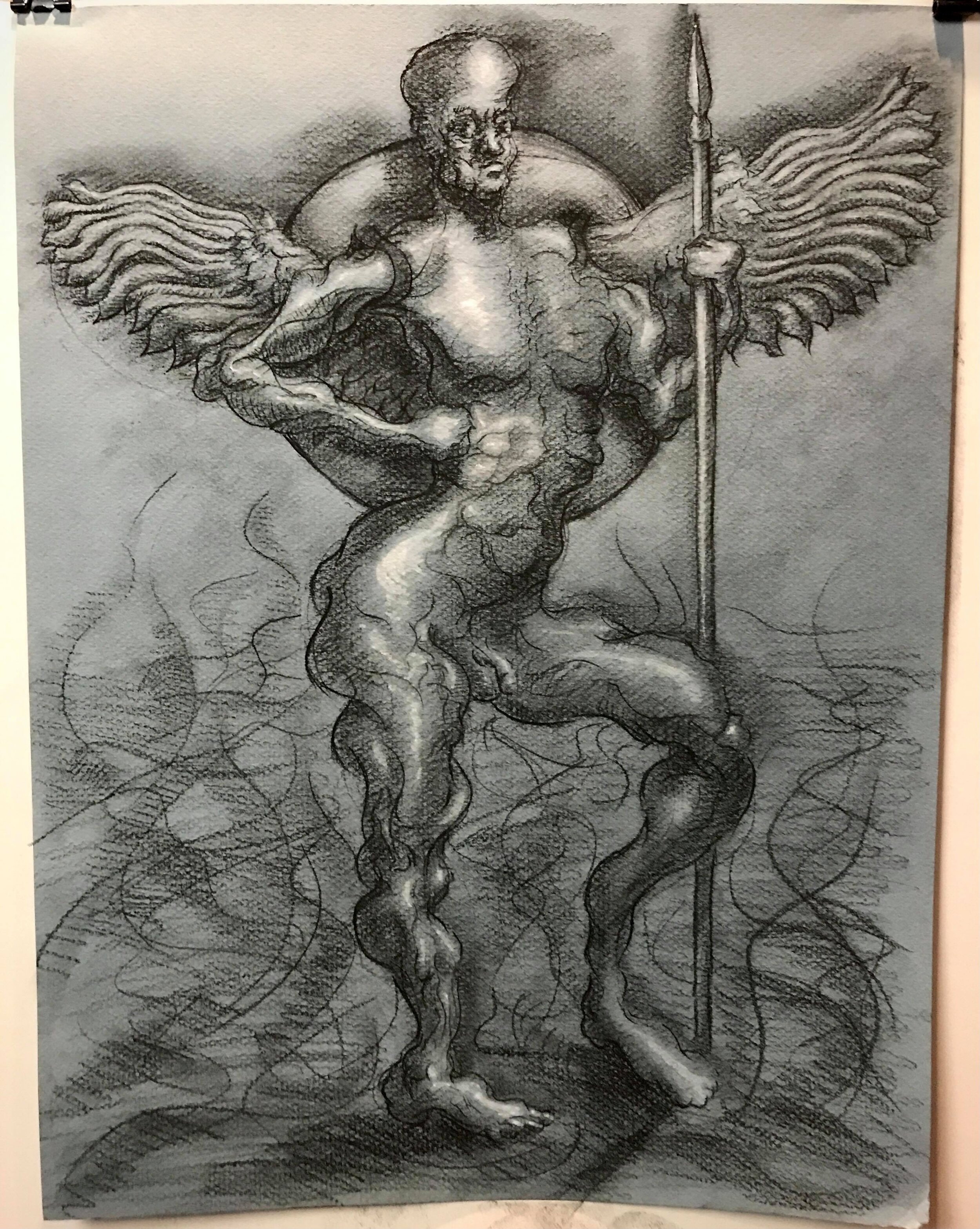
Let’s start with the new versions of Satan I’ve cooked up. I’ve turned the scene from Book I of Paradise Lost where Satan and his legions have been cast into Hell into a Procreate drawing. For a refresher, I had already worked up a conte and gouache drawing of this scene. Here’s that piece below:

Satan, fallen, stands to address his legions in Hell - conte and gouache on paper
As you can see, the first drawing was in black and white. The Procreate drawing was meant to help me think through some of the color questions I’ll be facing when I make this into an oil painting.

Satan, fallen, stands to address his legions in Hell - Procreate
Speaking of oil painting, I’ve finally finished the oil study of Satan’s head. As you can see above, my goal when painting Satan is to get as much chaos in the colors as possible in order to visually depict Satan’s inner turmoil. For the head study, I wanted to capture Satan’s descent into moral depravity, so I started with an underpainting using the Zorn palette, which only has a couple of colors. As I began working in the thick, impasto, chaotic blends of warms and cools, I ran into a problem — as I added more warm, it canceled out the cools, and vice versa, plus I was having trouble controlling my values (lights and darks). Here’s where the painting was when I last posted it:

Satan’s head (WIP) - oil study
Nothing a trip to the Met won’t fix! I decided to go poke around the impressionists, post-impressionists, and pointillists, and, sure enough, I found the fix. The key, as usual, lay in massing — creating large masses of light and dark, warm and cool, before adding smaller variations within them. If you look at this Renoir, for instance, the values and colors look blocked in in large shapes from a distance:

Renoir piece in the Metropolitan Museum of Art
But if you get closer, you can see smaller variations in color and value inside the masses:
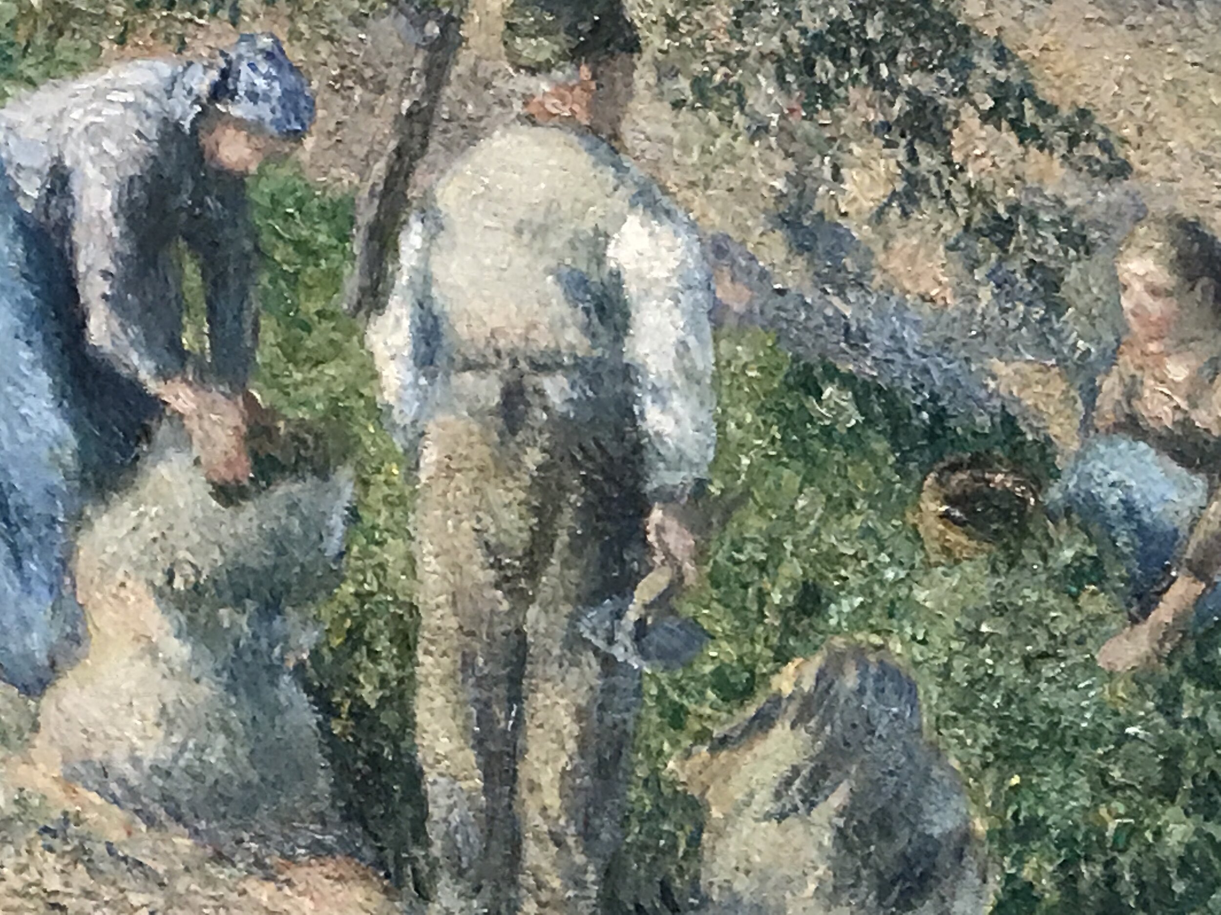
Renoir, detail
The same is true for this pointillist piece (I failed to take down the artist’s name, unfortunately):

Pointillist piece at the Metropolitan Museum of Art

Pointillist piece, detail

Pointillist piece, detail
With that in mind, I came back to the Satan head study. Focusing on massing first, I was able to work in more color chaos without messing up the values. That, plus a little stand oil, and voila, Satan:
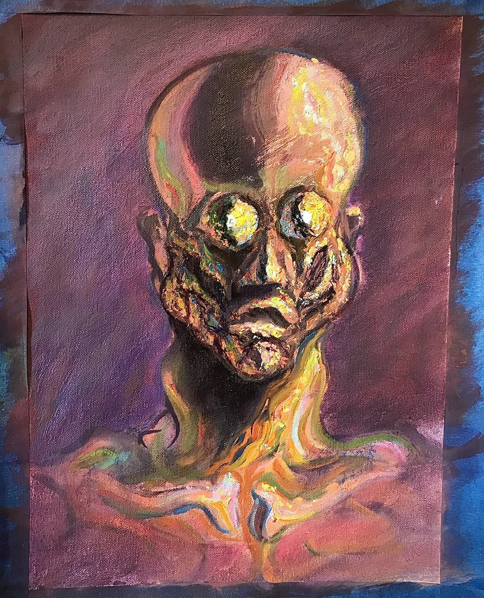
Satan’s head - oil study
My take is a lot more painterly and saturated than the Renoir or the pointillist piece (what can I say, I like big brushes and loud colors), but, if you look closely, you can see the same mass-first-vary-later principle at work:

Satan head, oil study - detail
In some less unsettling painting news, I’ve also been making some progress on the plein air WIP I posted last time:
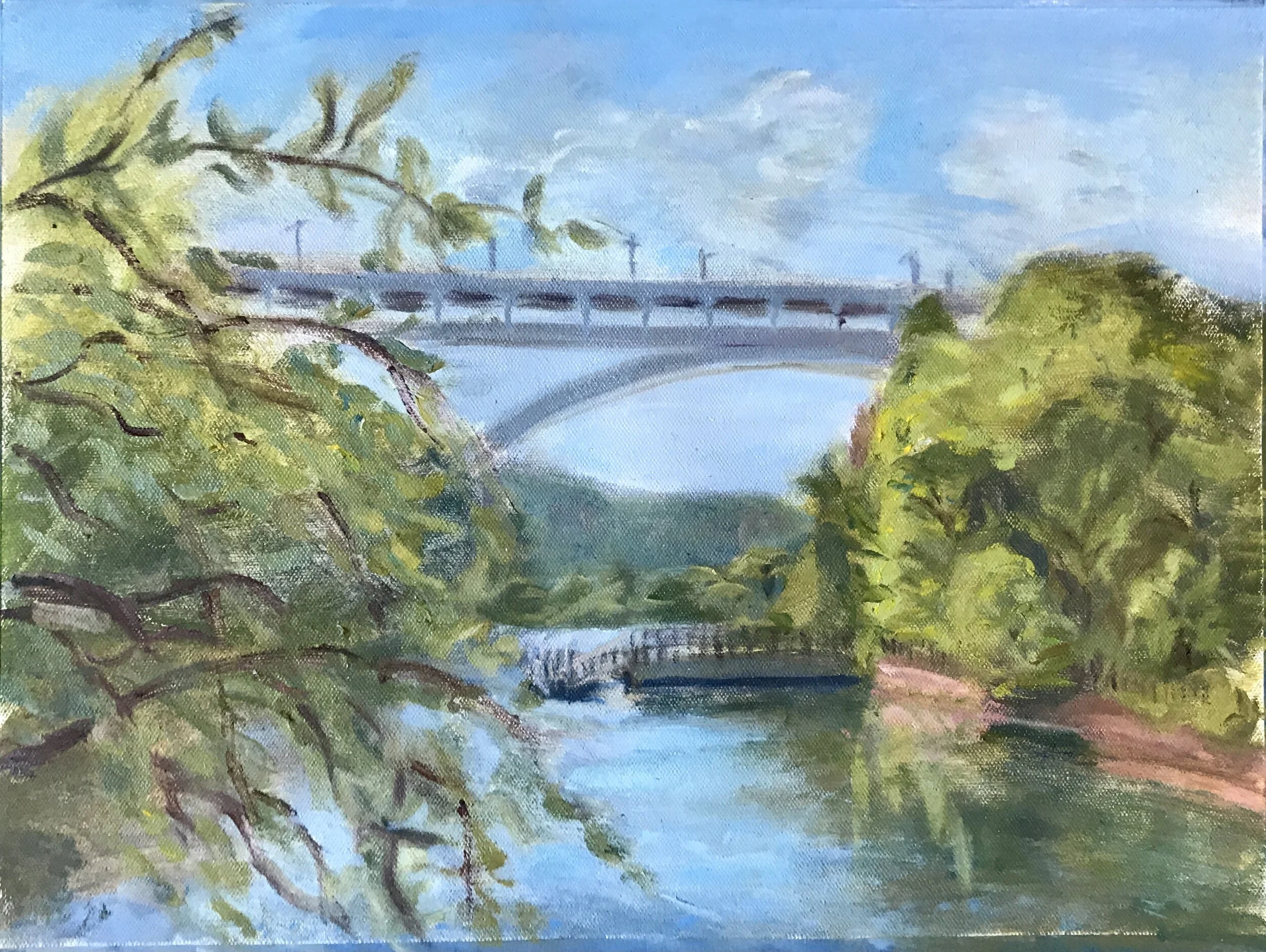
Inwood Hill Park, oil on canvas (WIP)
Between the tropical storms, flash floods, and heat waves, the weather has been keeping me painting indoors lately, but hopefully I’ll be able to get back out there and make some more progress on this soon.
In other news, I’ve got another collaboration coming up with my friend Kevin Shoemaker, a.k.a. Dandelot. For anyone who doesn’t know, Kevin is a really talented musician and producer. Kevin and I hung out in virtual reality a few weeks ago to do some live painting and playing/producing. If you missed it, check out the video below:
Kevin is releasing his debut album at the end of the summer. As part of the album release, I’m going to make a piece of visual art for every song, which I’m really excited about! You can keep up with the project and Kevin’s album release by stopping by his website and signing up for updates.
That’s it for this week! Check back in for more updates soon. Til then, have a great week, and keep creating!