realism

Satan! + some non-Miltonic art

Hi y’all,

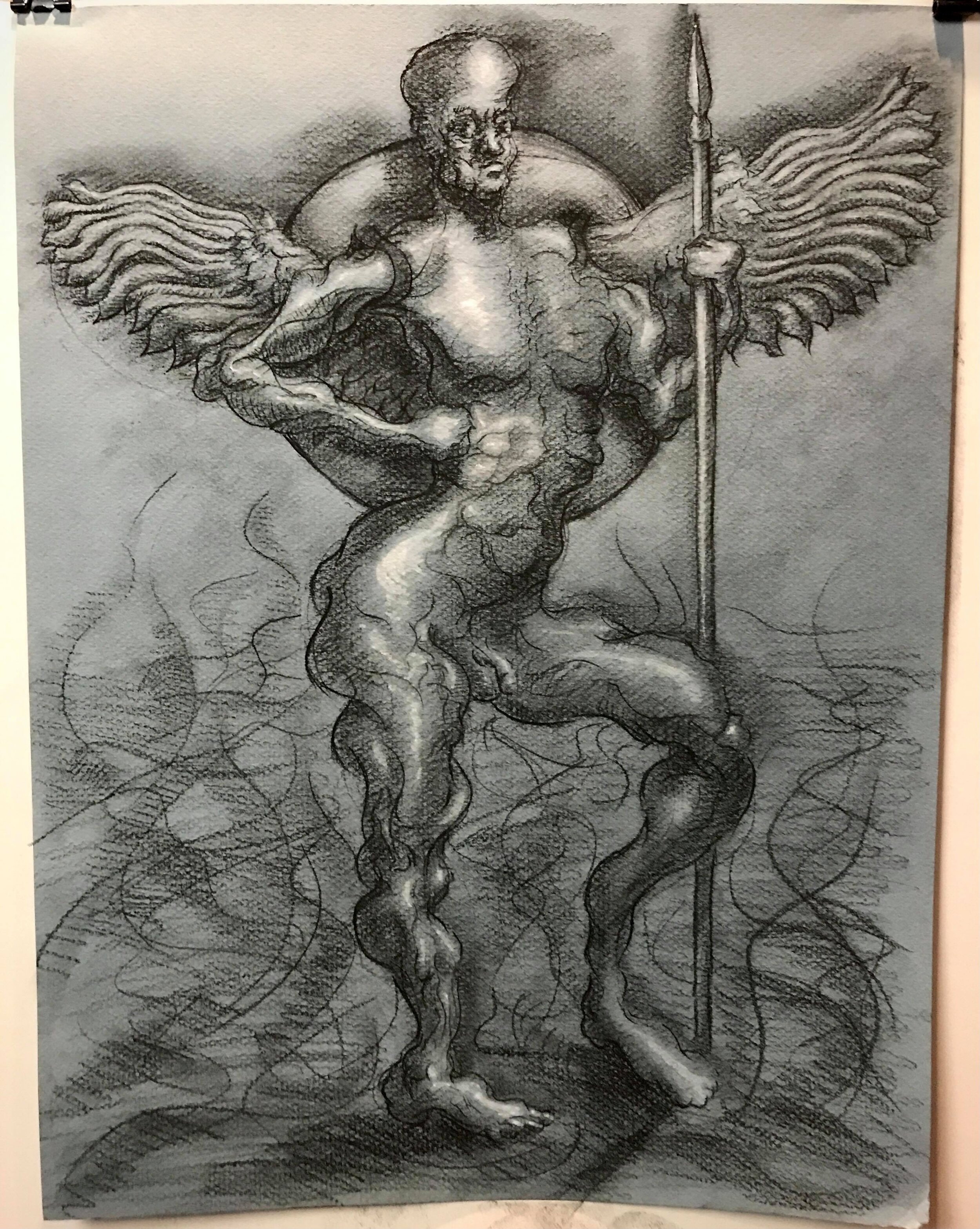
Welcome back to the blog! This week, I’ve got some new work on the Milton angels project, some plein air painting, and an update on collaborations. On the Milton side of things, I’m excited to share that I finally got through a finished drawing of a full-body (fallen) angel, head and all! Of course, I started with the best character in Paradise Lost: Satan.

Satan addresses the fallen legions in Hell, Paradise Lost, Book I — conte and gouache on paper

Satan addresses the fallen legions in Hell, Paradise Lost, Book I — conte and gouache on paper

This drawing started off as an attempt to fix the problems of the last full body angel I completed. That study, done in pen and ink on much smaller paper, came out a little awkward and too obviously stitched together for my taste. Here’s a reminder of what that looked like:

The first attempt at stringing together a full-body angel — pen and ink on paper

The first attempt at stringing together a full-body angel — pen and ink on paper

On the first angel, I worked from the previous anatomy studies I’ve completed for the Milton angels project, but I didn’t have any overall guide to reference (other than some gestural lines I made up at random). The result was an unfortunately clunky figure, a bit cartoonish and awkward. I’m much happier with the second one. For that drawing, I combined a finished figure drawing I did at The Art Students League with my angel anatomy studies. Here’s the finished drawing I was using as a reference:

Line/Tone/Value No. 7 — Conte, pen and ink, and gouache on paper

Line/Tone/Value No. 7 — Conte, pen and ink, and gouache on paper

The latest study started as an attempt to improve upon the shortcomings of the first full body angel, but, as I worked, it developed a life of its own. The staff of the figure reminded me of Satan’s spear from the beginning of Paradise Lost. The distorted head looked like a fallen angel.

So I decided to turn it into a scene near the beginning of the epic. Here, Satan and his legions have been cast out of Heaven, fallen through Chaos, and landed in Hell. Milton describes Hell as a “dungeon horrible” around which “one great furnace flamed”. However, Hell’s flames cast “[n]o light, but rather darkness visible”. To capture that, I kept some light on the top of the figure, but kept the flames on which Satan stands dark.

Milton also describes Satan as carrying a “ponderous shield” and a massive spear from the battle in Heaven. The shield is “massy, large, and round” and “[hangs] on his shoulders like the moon”, while the spear is the size of “the tallest pine / Hewn on Norwegian hills”. I had a lot of fun playing with the scale of the imagery there.

For painting these past two weeks, I took a break from Milton-related work to do some plein air. The plein air painting is still in progress, but it’s been so nice to get outside and paint when the weather’s nice. Check out the WIP below:

Inwood Hill Park, oil on canvas (WIP)

More updates there soon. And don’t forget you can get behind-the-scenes time lapse videos and process photos of this painting, the Milton illustrations, and whatever else I’m working on by subscribing to my Patreon!

I also got to spend a night painting and chatting with the very talented Kevin Shoemaker while he produced music for us in virtual reality. It was a strange and fun experience, one very apt for the (hopefully?) tail end of COVID. Check out the video of our collaboration below:

And here’s the finished version of the painting I made to Kevin’s music:

Collaborative painting with Kevin Shoemaker, oil on canvas

Collaborative painting with Kevin Shoemaker, oil on canvas

You can find the rest of Kevin’s virtual reality hangs, as well as some great singles from his upcoming album, on his YouTube channel. And don’t forget to stop by his website, too.

That’s it for this week! Thanks for stopping by. Have a great week and keep creating!

Good angels, bad angels?

Hi y’all,

Welcome back to the blog! This week, I’ve been thinking through how to represent John Milton’s ideas about good and evil in paint.

As I shared in last week’s post, I’ve been working through how I might illustrate Milton’s Satan. The tricky thing is that Satan is radiant, beautiful, and, in some ways, good, but grows more distorted and tormented as the epic progresses. To get at both of these ideas, I wanted the luminosity to really pop while also using a wider, wilder array of colors, textures, and brush strokes. In the end, this is where I landed:

Satan torso, back view, oil study (finished)

Satan torso, back view, oil study (finished)

After finishing the Satan torso oil study, I moved on to angel limbs. As usual, I started with a pen and ink study of the human anatomy, then distorted it. I did them both on one page this time to make the comparison a little more user-friendly:

Human arm (left) and angel arm (right), pen and ink

Human arm (left) and angel arm (right), pen and ink

I started the oil study soon after completing the pen and ink drawings. To be honest, I don’t think I’d actually decided whether I was painting a good angel or a bad angel before I started painting. I’m still not finished, but I’m leaning towards good.

Angel arm, side view, oil study (WIP)

Angel arm, side view, oil study (WIP)

In my view, the source of sin in Milton’s universe is a combination of doubt and arrogance. Satan falls because his arrogance leads him to believe that it’s somehow a good idea to start a rebellion against an omnipotent ruler (God). He leads Adam and Eve to their fall (and to his own subsequent torture in Hell) because he doubts his ability to redeem himself. Between these two character flaws, Satan is his own worst enemy. Adam and Eve fall for similar reasons. Beguiled by Satan, they doubt God’s commandments, trusting Satan’s pseudo-logic instead.

If doubt and arrogance are the two primary sources of sin in Milton’s universe, then I think that painting a good/unfallen angel is less about keeping out the darker, more turbulent colors, brushstrokes, etc., and more about keeping the visual language consistent and organized, no matter how dark or light it gets. Because this piece is, so far at least, more traditionally organized than the Satan torso, I’m leaning towards “good angel” for this one.

I do think this study got a little too distorted to really be believable as an arm, angel or no, so, as I get ready for my next study, I’ve been thinking a lot about just how far I can distort the anatomy before it ceases to read as anatomy at all. To that end, I’ve worked up a Procreate study of an angel leg, keeping it a little closer to human anatomy than the direction I’ve been heading in for the oil arm study:

Angel leg, back view, Procreate

Angel leg, back view, Procreate

It’s been a few posts since I’ve shown the original pen and ink studies that the Procreate leg is based on, so I’ve included them below:

Angel legs, side view (left) and back view (right), pen and ink

Angel legs, side view (left) and back view (right), pen and ink

Human legs, side view (left) and back view (right), pen and ink

Human legs, side view (left) and back view (right), pen and ink

That’s it for this week! Check back in next week for updates on the Milton project and any other art news I’ve got to share. Thanks so much for reading, and have a great week!